Settings
On your settings page you manage your own devices and decide how the dashboard looks. Use the index below to jump to a topic.
1. How this page works
At the top are the tabs. Each tab is one section: your devices, alarms, cookies, preferences and information about FairGrow. Click a tab to open that section; you stay on the same page.
With the language picker in the header you switch between Dutch, English, Russian and Armenian.
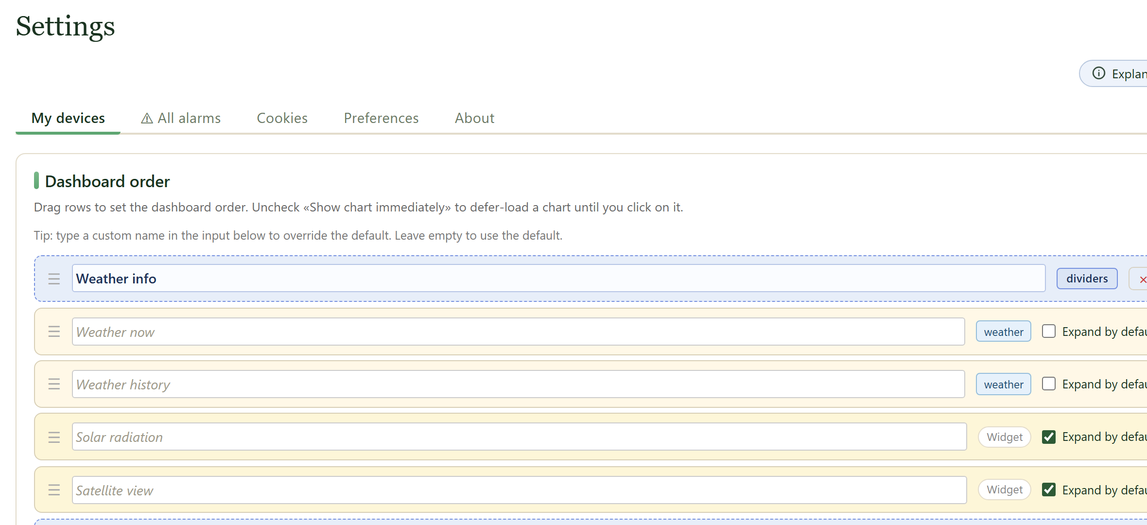
2. My devices
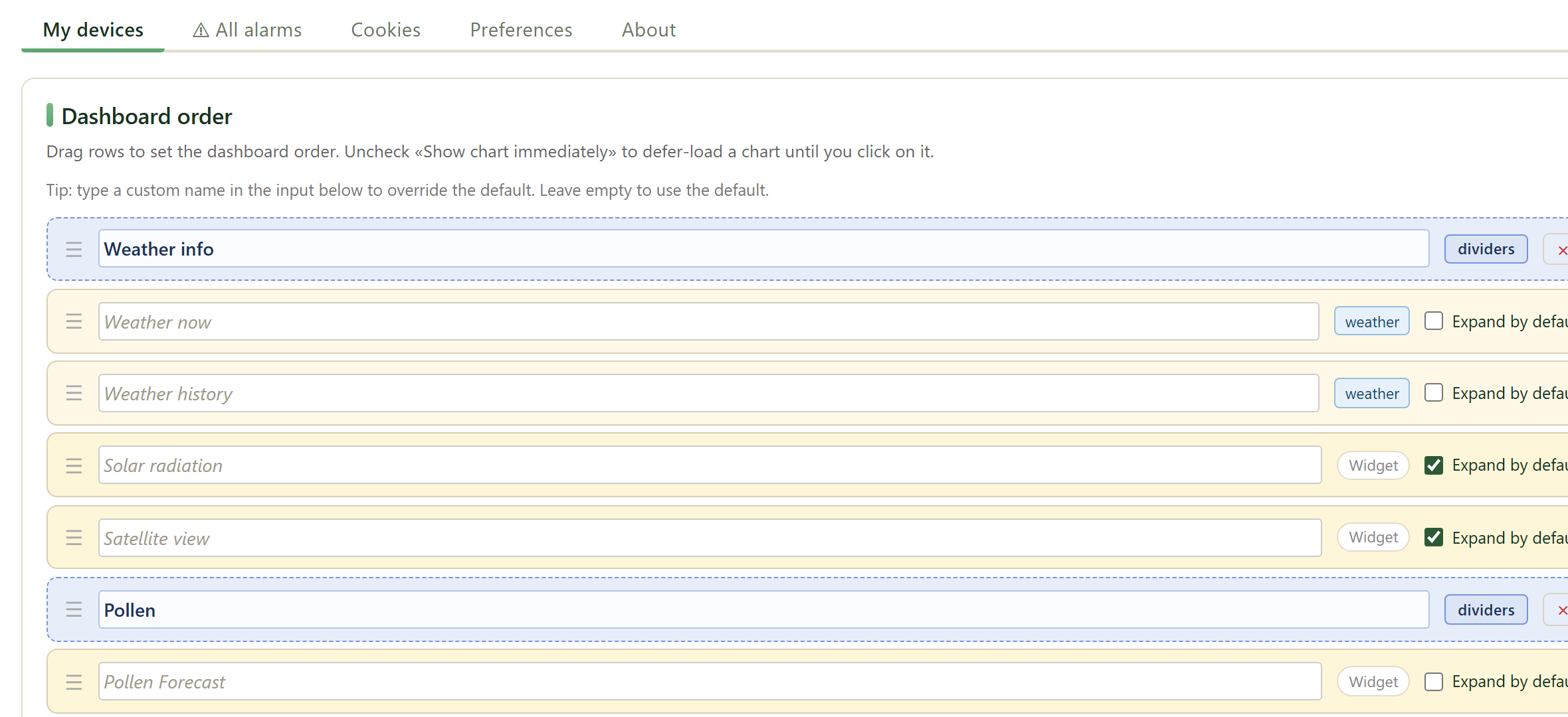
On «My devices» you arrange your dashboard and manage your devices. Drag the rows to set the order, give a card its own name, choose whether a card expands immediately and add divider bars to group them.
Below are your devices with their status, location and latest reading. Open a row for the details.
3. All alarms
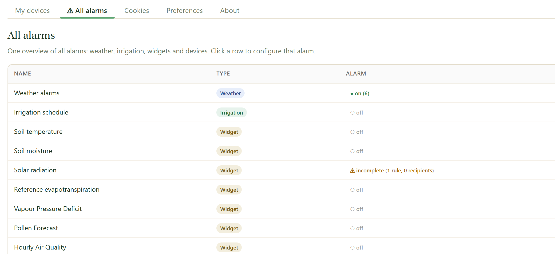
«All alarms» gives one overview of all your alarms: weather, irrigation, widgets and devices. Click a row to configure that alarm.
The «Notifications per user» table shows who receives a notification, by email or Telegram, when the last one was sent and whether there were issues.
4. Cookies
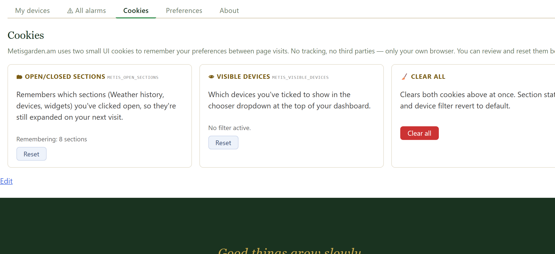
This tab shows which cookies FairGrow stores in your browser and what for. You can change your choice here at any time.
Most cookies are functional: they remember your language, your collapsed sections and whether you are logged in.
5. Preferences
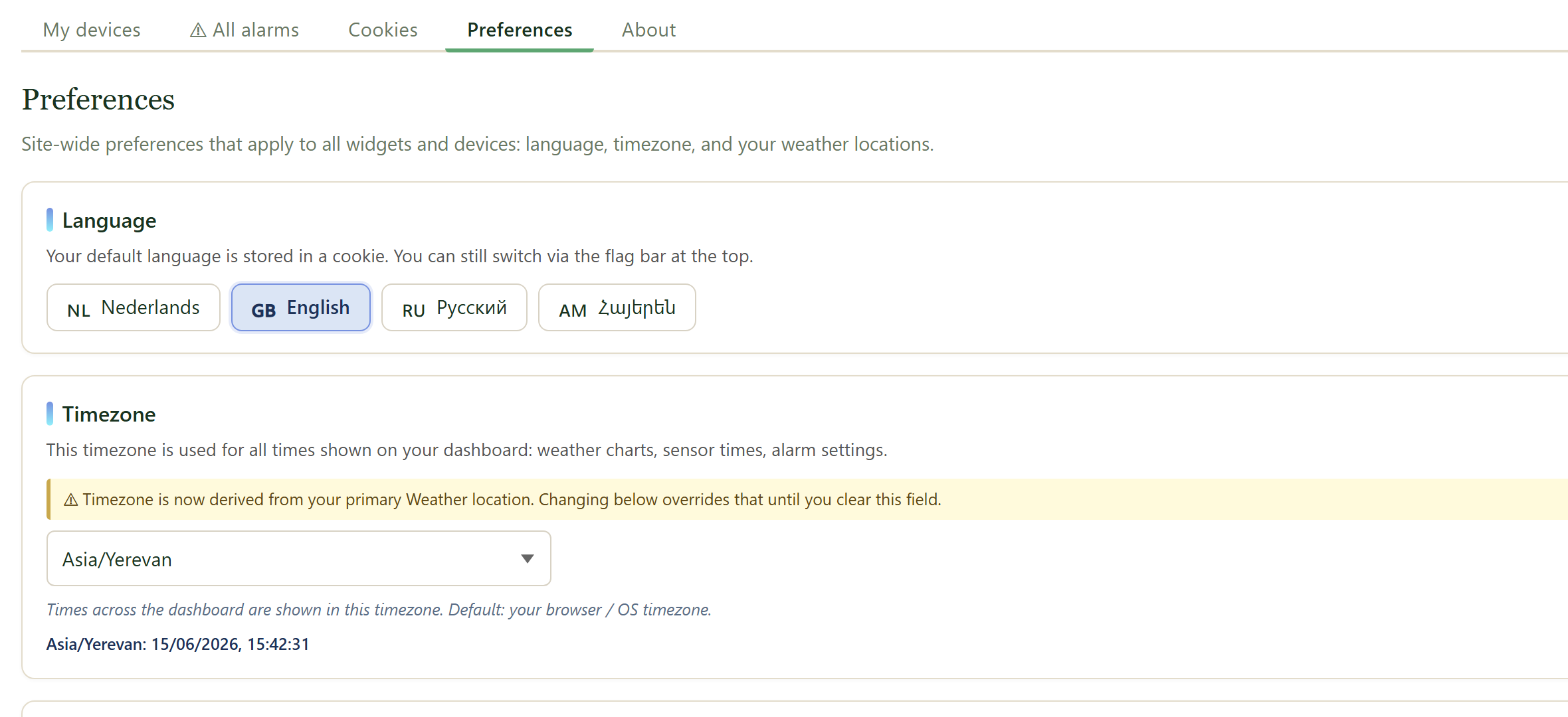
Here you set your preferences: your language, the units and display options. Changes apply immediately and are kept for your next visit.
6. About
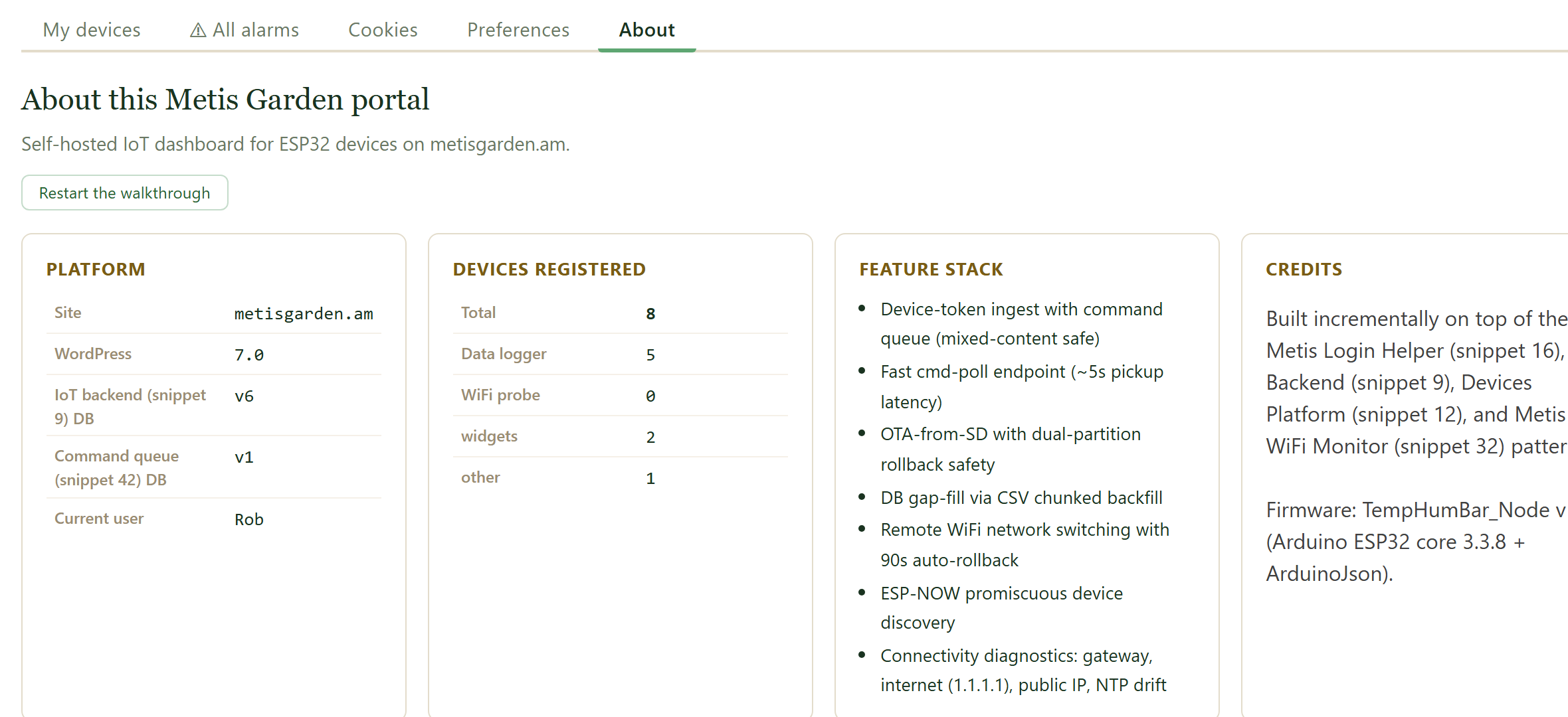
The «About» tab shows the FairGrow version and brief background information. Handy when you report a question or issue: mention the version number.
Your sensor devices
Some boards measure several things at once. Here is how they appear on your dashboard.
1. One board, several readings
A satellite board can carry several sensors. You see them as separate rows under the same device, not as separate devices.
- ☀️ Lighthow much light there is
- 🌡 Air temperaturetemperature of the air
- 💧 Air humiditymoisture in the air
- 🌱 Soil moisturemoisture in the soil
- 🌡 Soil temperaturetemperature in the soil
2. Open a sensor for detail
Click a row to open the sensor. You see its chart, when it was last seen, and buttons to calibrate or hide it.
3. How the data reaches you
The sensor sends small radio messages to a nearby gateway. The gateway forwards everything to the server.
A value can be up to about 60 seconds old.
Calibrate a sensor
Sensors can drift over time. You can adjust them yourself, without re-flashing the firmware.
1. Soil moisture: wet and dry
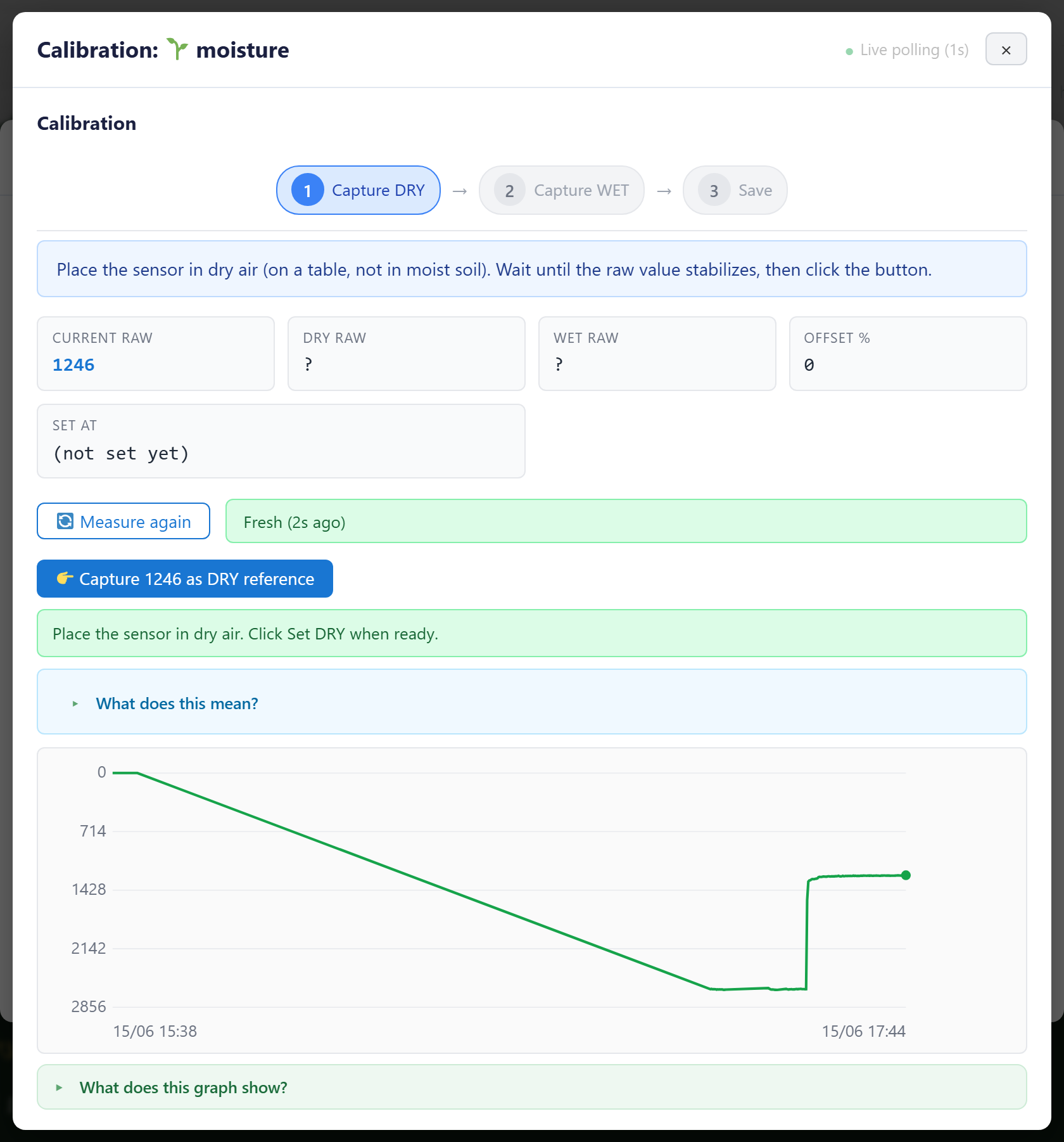
Calibration works in three steps. Follow the hints at the top of the window.
- 1. Dryplace the sensor in dry air and capture
- 2. Wetin wet soil or water, then capture
- 3. Savestore the calibration
2. Temperature and humidity: reference
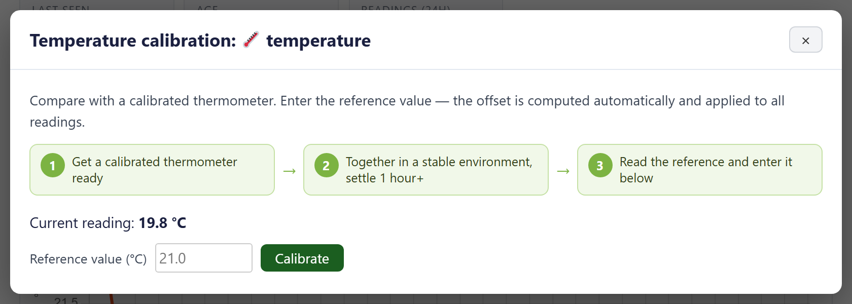
Compare with a trusted instrument and enter the reference value. The offset is calculated automatically and applied everywhere.
- Same spotlet both settle together, over an hour
- Referenceread your trusted meter and enter that value
3. Resetting
We store a calibration on the server, so it survives a restart or firmware update. To go back to the raw reading, set the offset to zero.
Hide a ghost sensor
Sometimes a mis-wired board shows a sensor that is not really there. Here is how to hide it.
1. What is a ghost sensor
A ghost sensor gives an impossible value, for example soil moisture at 100% on a board without a moisture probe. It does not belong on your dashboard.
2. Hide and bring back
Open the sensor and use the button to ignore it. Hidden sensors move to a list, where one click brings them back.
- Ignoreclick twice to confirm
- Bring backfrom the Hidden sensors list
Weather history
Weather history shows the measured weather over a longer period per location. Use the index below.
1. What this widget shows
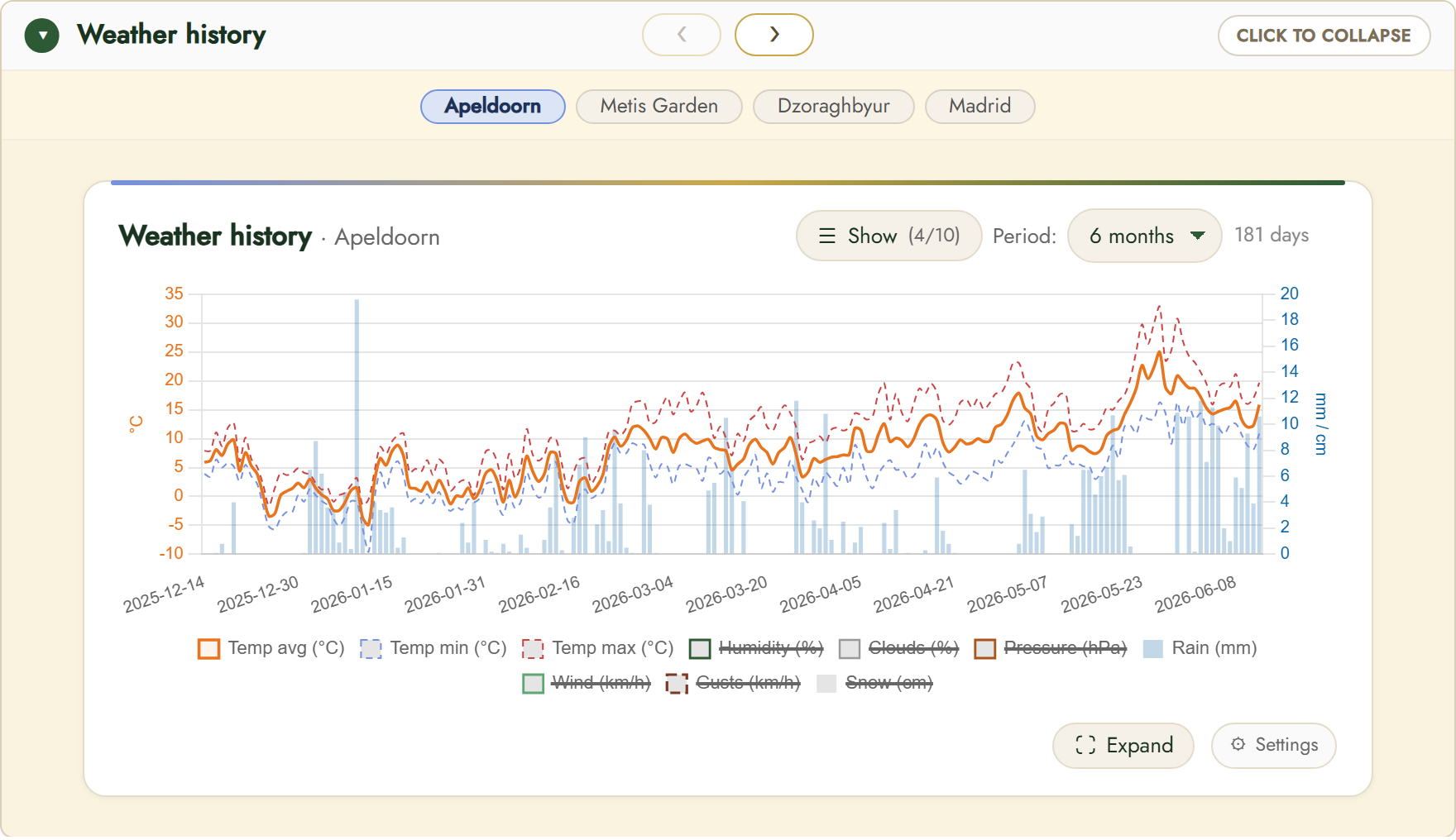
The chart shows daily values: average/min/max temperature, humidity, clouds, pressure, rain, wind, gusts and snow. With multiple locations you switch via the tabs at the top. «Period» sets how far back you look (up to 2 years).
2. How it works
From daily measurements to a trend that helps you look ahead.
Series can feed sensor compare for ML/AI predictions.
3. Controls and settings
Use «Show» to choose which series appear and «Period» for the time window.
«Expand» opens the chart in a large window; «Settings» controls the series, the axes and whether this data is included in sensor compare (for ML/AI predictions). The dotted «now» line separates measured data from the forecast.
Shortwave radiation
The solar radiation reaching the surface, in W/m². Use the index below.
1. What this widget shows
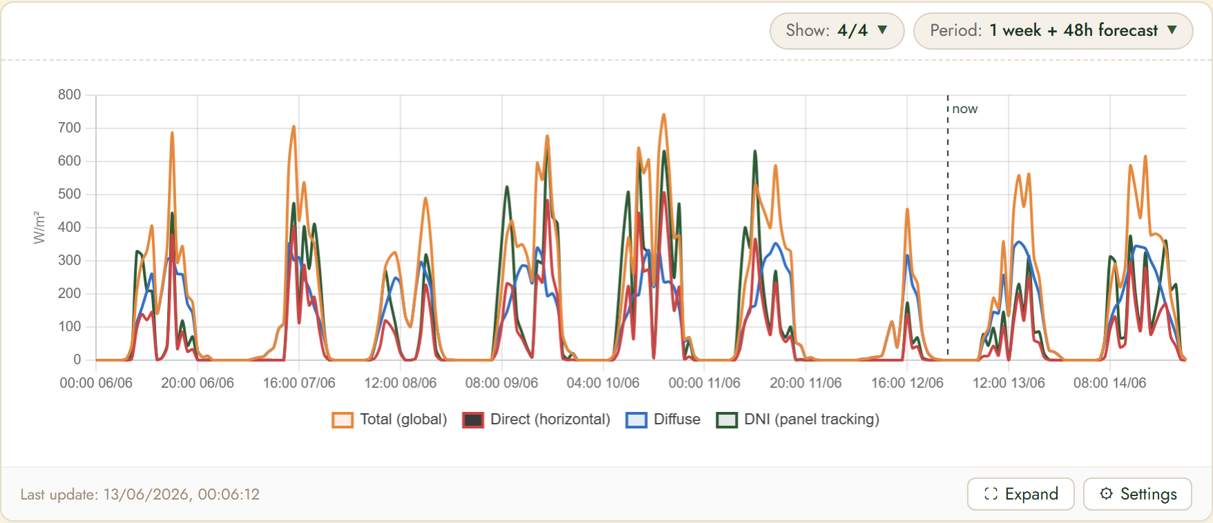
The chart shows four series: Total (global), Direct (horizontal), Diffuse and DNI (panel tracking). Useful to gauge how much sun your plants or solar panels receive. Peaks are around midday; at night radiation is zero.
2. How it works
Four radiation series together show how much sun your plants or panels really get.
At night radiation is zero.
3. Controls and settings
Use «Show» to choose which series appear and «Period» for the time window.
«Expand» opens the chart in a large window; «Settings» controls the series, the axes and whether this data is included in sensor compare (for ML/AI predictions). The dotted «now» line separates measured data from the forecast.
Reference evapotranspiration (ET₀)
How much water a reference crop evaporates, in mm/hour (FAO-56). Use the index below.
1. What this widget shows
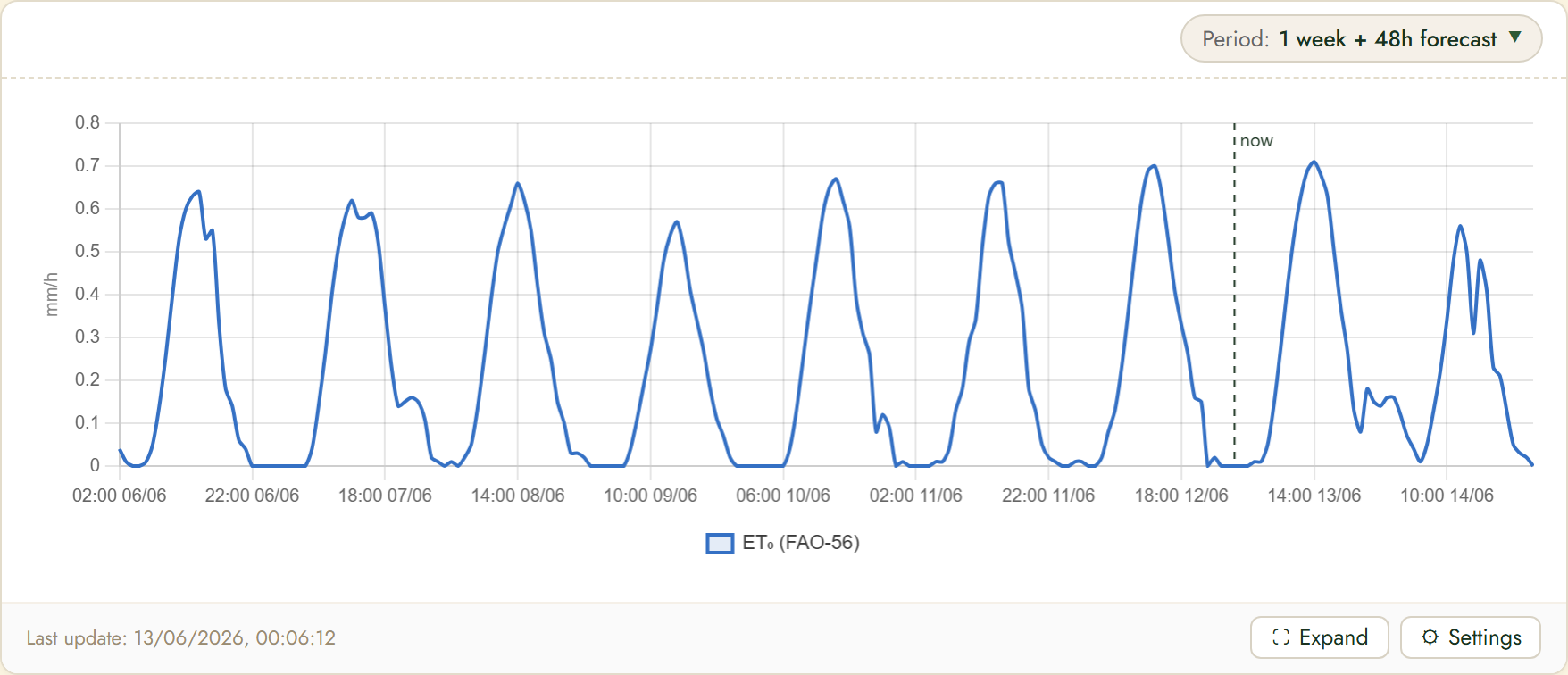
ET₀ (FAO-56) combines temperature, radiation, wind and humidity into the evaporative demand. High daytime peaks mean a lot of water loss; together with the irrigation widget this drives how much to water.
2. How it works
The weather sets how much water evaporates; together with soil moisture it drives your watering.
High daytime peaks mean a lot of water loss.
3. Controls and settings
Use «Show» to choose which series appear and «Period» for the time window.
«Expand» opens the chart in a large window; «Settings» controls the series, the axes and whether this data is included in sensor compare (for ML/AI predictions). The dotted «now» line separates measured data from the forecast.
Vapour pressure deficit (VPD)
How «dry» the air feels to the plant, in kPa. Use the index below.
1. What this widget shows
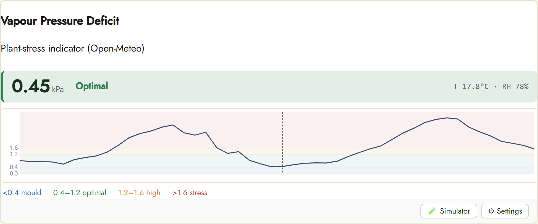
VPD is computed from temperature (T) and humidity (RH). The coloured bands show plant stress: <0.4 mould risk, 0.4–1.2 optimal, 1.2–1.6 high, >1.6 stress. The large number is the current value with a status label.
2. How it works
From temperature and humidity comes the VPD, telling you whether the climate suits the plant.
Use the simulator to plan settings in advance.
3. Simulator (what-if)
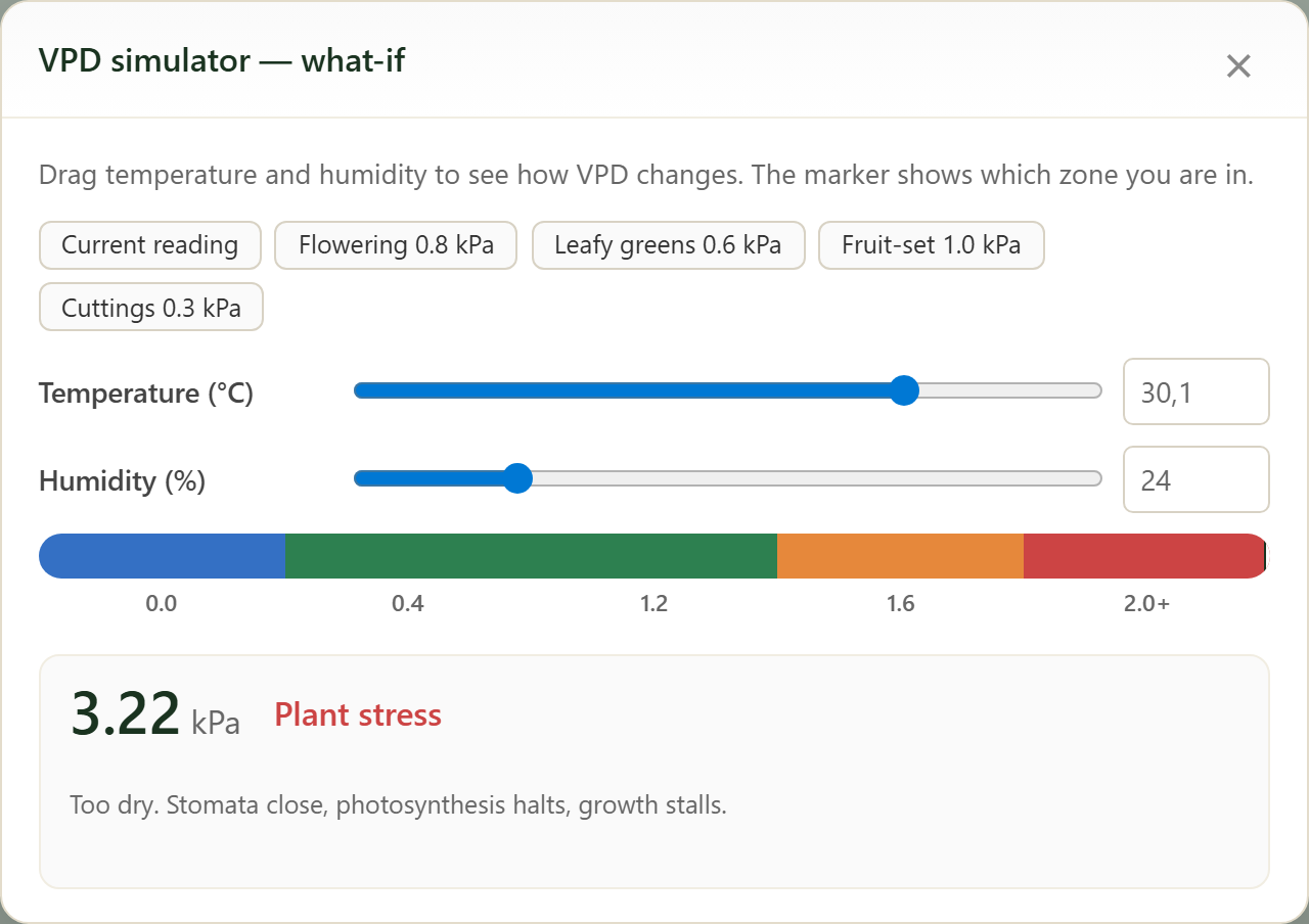
Click «Simulator» and drag the temperature and humidity sliders to see how the VPD changes. The coloured bar shows which zone you land in (mould / optimal / high / stress).
The presets (Cuttings 0.3 / Leafy greens 0.6 / Flowering 0.8 / Fruit-set 1.0 kPa) jump to a target per growth stage, so you can plan greenhouse settings in advance.
4. Controls and settings
Use «Simulator» to slide T and RH and see how VPD changes (handy to plan greenhouse settings). «Settings» controls the display. The band legend is below the chart.
Irrigation planning and advice
Whether and how much to water, based on evaporation and soil moisture. Use the index below.
1. What this widget shows
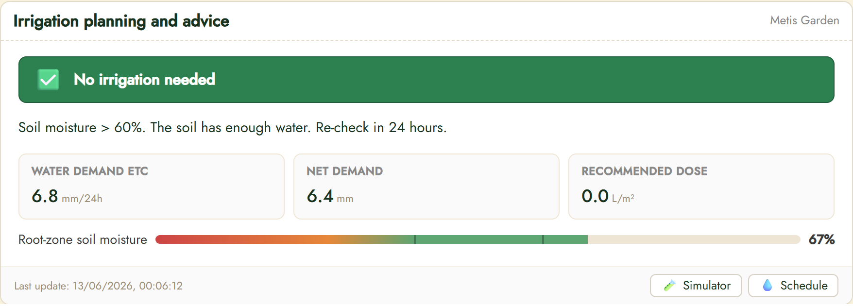
The banner says whether irrigation is needed. Below: Water demand (ETc, mm/24h), Net demand (mm) and Recommended dose (L/m²). The bar shows root-zone soil moisture in percent. With enough moisture the dose is 0.
2. How it works
Evaporation and soil moisture are combined into a concrete watering dose in litres.
With enough moisture the dose is 0.
3. Simulator (work out irrigation)
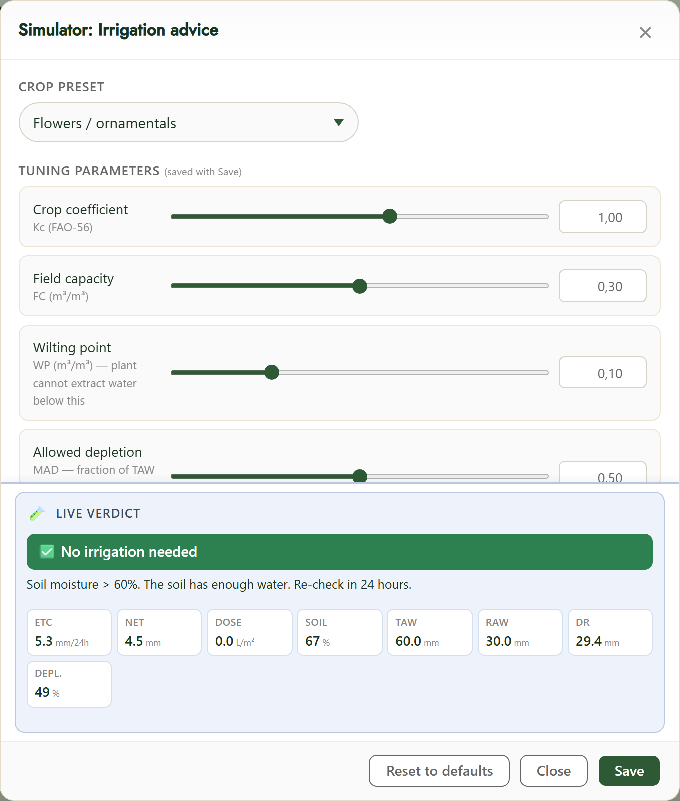
With «Simulator» you work out the watering advice for your crop.
Pick a crop preset and tune the FAO-56 parameters: crop coefficient (Kc), field capacity (FC), wilting point (WP) and allowed depletion (MAD).
The «Live verdict» instantly shows ETc, net demand, dose and soil moisture (TAW/RAW/Dr/depletion). «Save» stores your settings, «Reset to defaults» restores them.
4. Controls and settings
«Simulator» lets you run scenarios; «Schedule» plans a watering moment. The advice refreshes automatically from the latest forecast.
Soil temperature by depth
Soil temperature at different depths, in °C. Use the index below.
1. What this widget shows
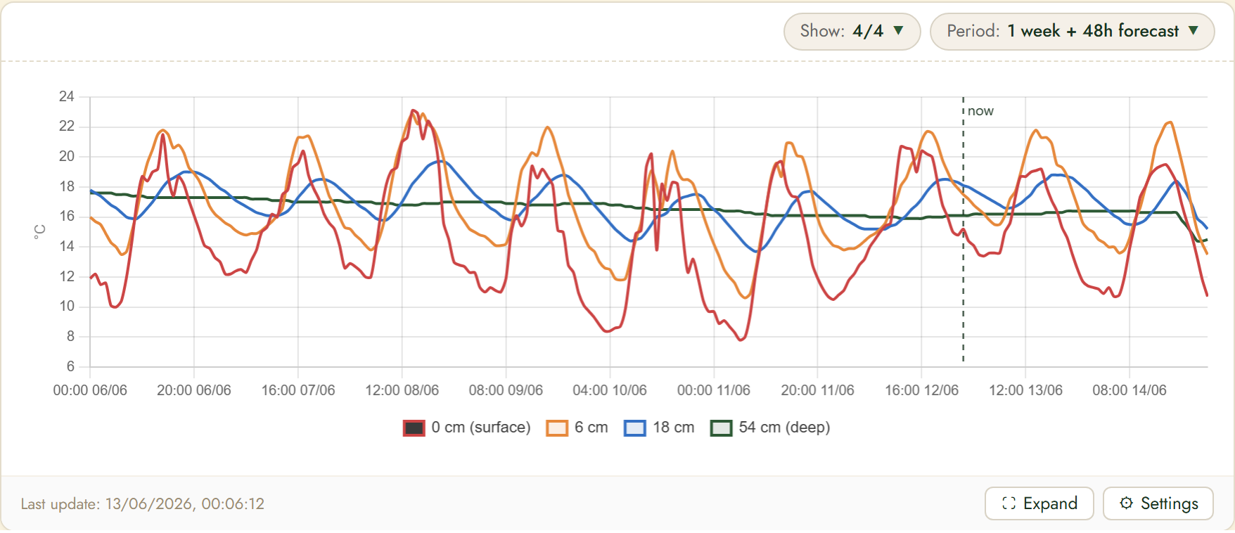
Each line is a depth: 0 cm (surface), 6 cm, 18 cm and 54 cm (deep). At the surface it swings strongly per day; deeper it is steadier and lags behind. Important for germination and root growth.
2. How it works
Soil temperature at four depths tells you when to sow and how the roots are doing.
Important for germination and root growth.
3. Controls and settings
Use «Show» to choose which series appear and «Period» for the time window.
«Expand» opens the chart in a large window; «Settings» controls the series, the axes and whether this data is included in sensor compare (for ML/AI predictions). The dotted «now» line separates measured data from the forecast.
Soil moisture by layer
Volumetric soil moisture per layer, in m³/m³. Use the index below.
1. What this widget shows
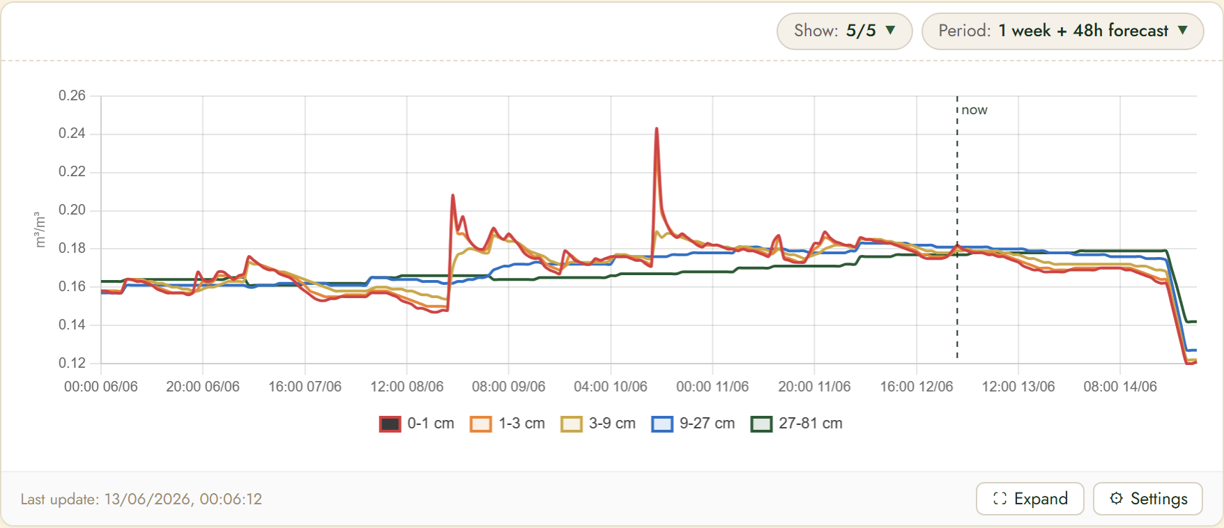
Each line is a layer: 0–1, 1–3, 3–9, 9–27 and 27–81 cm. Rain first appears as a spike in the top layers and then slowly moves deeper. Together with irrigation and ET₀ this drives your watering strategy.
2. How it works
Rain sinks layer by layer into the soil, so you see how much moisture really reaches the root zone.
Together with ET₀ and irrigation this drives your watering.
3. Controls and settings
Use «Show» to choose which series appear and «Period» for the time window.
«Expand» opens the chart in a large window; «Settings» controls the series, the axes and whether this data is included in sensor compare (for ML/AI predictions). The dotted «now» line separates measured data from the forecast.
Pollen forecast
The forecast pollen concentration per type, in grains/m³. Use the index below.
1. What this widget shows
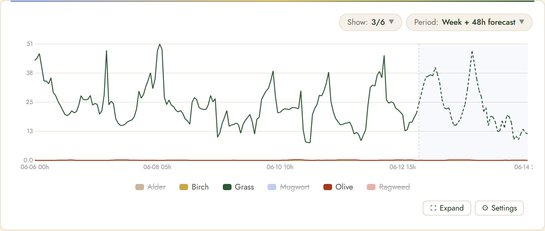
Each line is a type: Alder, Birch, Grass, Mugwort, Olive and Ragweed. Use «Show» to toggle types (inactive types are struck through in the picture). The shaded part on the right is the forecast.
2. How it works
The forecast pollen per type helps you plan when to go outside or take medication.
High peaks mean more symptoms; plan calmer moments.
3. Controls and settings
Use «Show» to choose which series appear and «Period» for the time window.
«Expand» opens the chart in a large window; «Settings» controls the series, the axes and whether this data is included in sensor compare (for ML/AI predictions). The dotted «now» line separates measured data from the forecast.
Hourly air quality
Hourly air quality with an AQI label. Use the index below.
1. What this widget shows
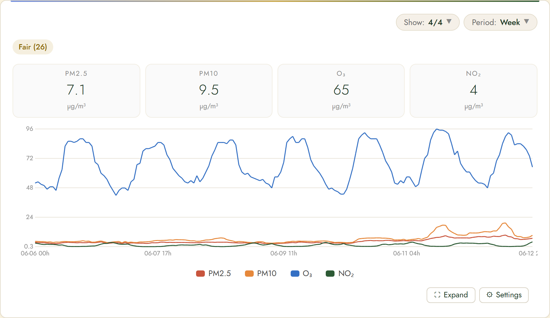
At the top is the summary index (e.g. «Fair (26)») with current values for PM2.5, PM10, O₃ and NO₂ in µg/m³. The chart shows the trend; ozone (O₃) usually peaks in the afternoon. Use «Show» to pick which pollutants you see.
2. How it works
An hourly AQI label tells you at a glance whether it is a good moment to go outside.
Ozone usually peaks in the afternoon.
3. Controls and settings
Use «Show» to choose which series appear and «Period» for the time window.
«Expand» opens the chart in a large window; «Settings» controls the series, the axes and whether this data is included in sensor compare (for ML/AI predictions). The dotted «now» line separates measured data from the forecast.
Pest & disease monitor
The risk of plant diseases and pests based on the weather. Use the index below.
1. What this widget shows
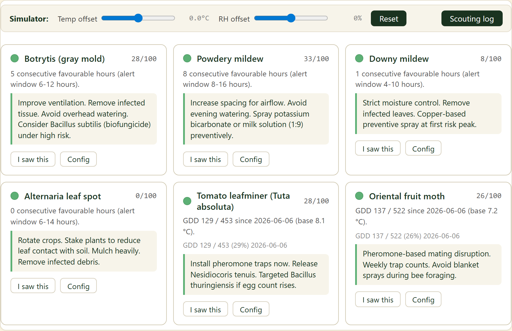
Per disease/pest (e.g. Botrytis, powdery/downy mildew, Tuta absoluta) you see a risk score (x/100) and the number of favourable hours for the pest. Concrete advice is shown below. «I saw this» logs an observation; «Config» sets the alert.
2. How it works
The weather feeds a risk model per pest; at high risk you get advice and an alert.
With «Scouting log» you combine the model with what you see in the greenhouse.
3. Controls and settings
At the top you can set a temperature and RH offset with «Simulator» to test scenarios, and «Scouting log» shows your earlier observations. This combines the model with what you actually see in the greenhouse.
Pollen dashboard
Own indoor-air and pollen data from a Home Datalogger, combined with the forecast. Use the index below.
1. What this widget shows
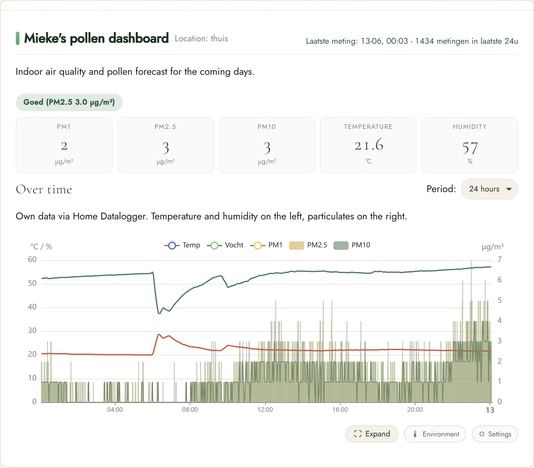
At the top an air-quality label plus current PM1, PM2.5, PM10, temperature and humidity. The «over time» chart plots temperature and humidity (left) against particulates (right). The data comes from your own datalogger, not just the forecast.
2. How it works
Your own indoor-air and pollen data from a Home Datalogger, with the forecast, give a personal picture.
This shows indoor versus outdoor in one place.
3. Pollen forecast
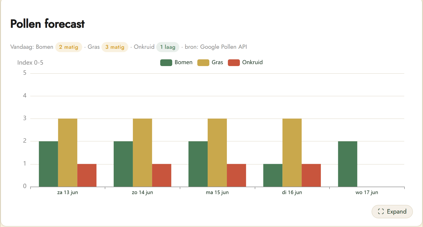
Below your own sensor data is the pollen forecast (source: Google Pollen API). «Today» summarises the level for Trees, Grass and Weeds (low / moderate / high). The chart shows the 0–5 index per category per day, so you can see when a peak is coming.
4. Official NL pollen sources
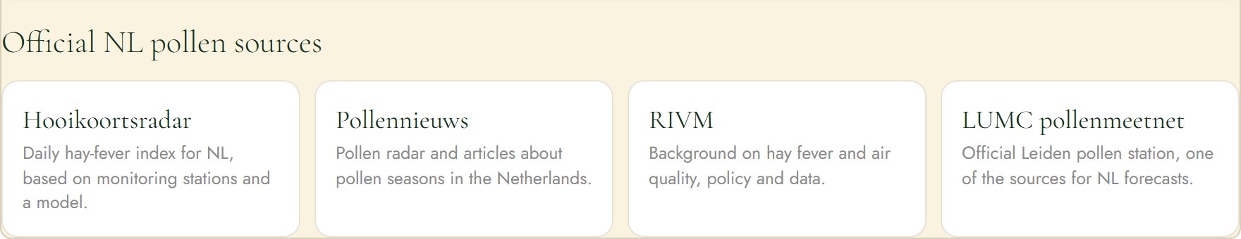
At the bottom are official Dutch pollen sources to cross-check the forecast: Hooikoortsradar (daily hay-fever index), Pollennieuws (radar and articles), RIVM (background on hay fever and air quality) and the LUMC pollen network (official Leiden station).
Click a source to open its website.
5. Controls and settings
Use «Period» for the time window, «Expand» opens the chart large and «Environment»/«Settings» show extra detail and options. The values refresh continuously from the datalogger.
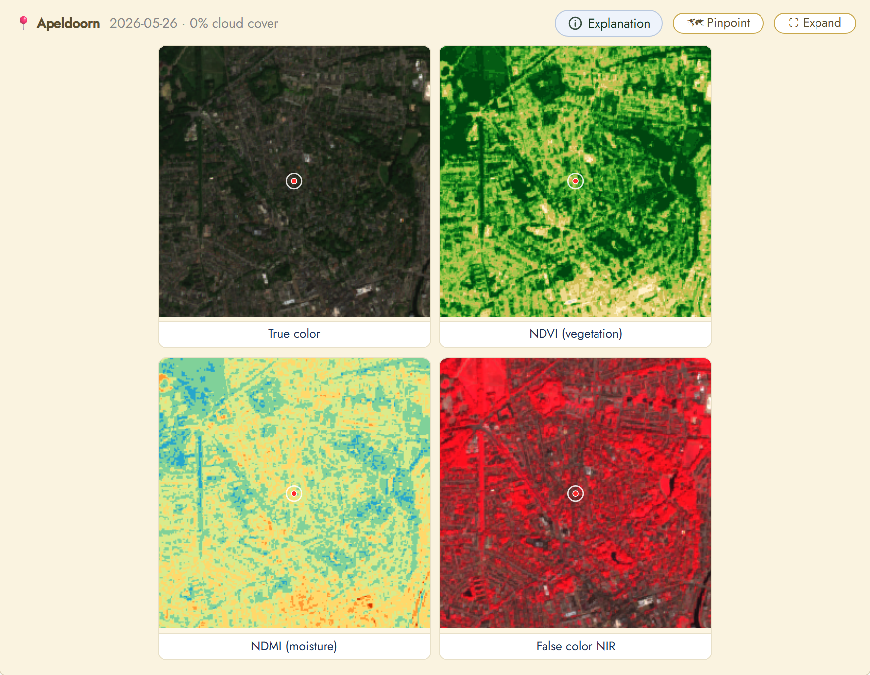
Satellite view
Sentinel-2 satellite imagery of your location with vegetation and moisture indices. Use the index below.
1. What this widget shows
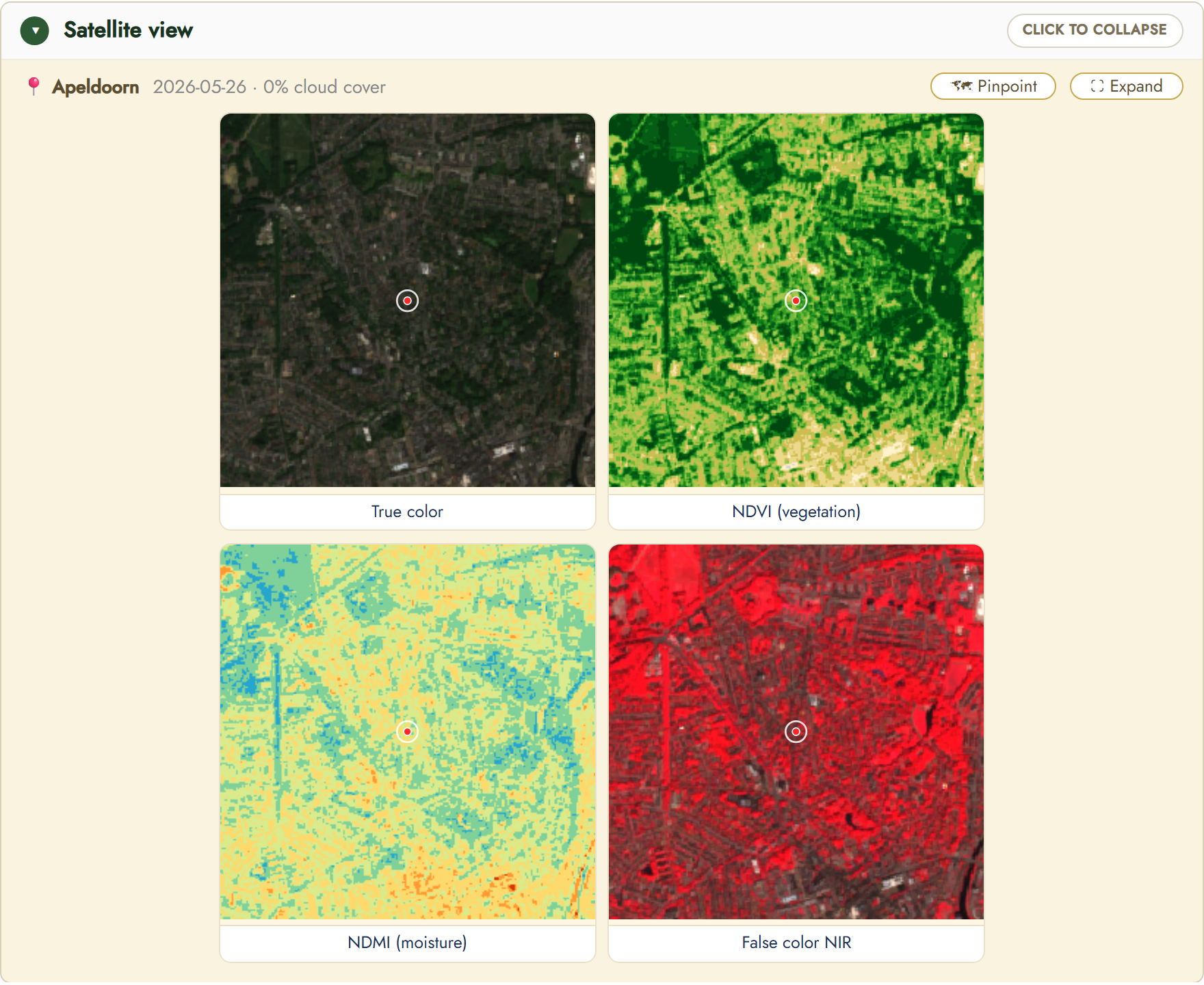
Sentinel-2 shows your garden or field from space. You see four views of the same scene: True color (a real image), NDVI (vegetation vigour), NDMI (moisture) and False color NIR (near-infrared).
At the top are the date and the cloud-cover percentage. Fewer clouds means a more reliable image; the widget automatically picks the most recent, least-cloudy scene.
Click a view to open it large. In the large window you find more indices (NDWI for water, EVI for growth, SWIR) and a chart that tracks the index over time.
2. The four views
True color is how your garden actually looks from space. Best for orientation and comparison with an ordinary map.
NDVI shows the vigour of the vegetation. Dark green is peak growth, yellow is dry or stressed, brown is bare soil or water.
NDMI shows the moisture content. Bluer means more moisture in leaves and soil, orange or brown is dry. This shows when a field needs water.
False color NIR turns vegetation bright red: the deeper the red, the denser the growth. Cyan or blue is water or bare soil, handy to compare growth stages between fields.
3. Draw your own field
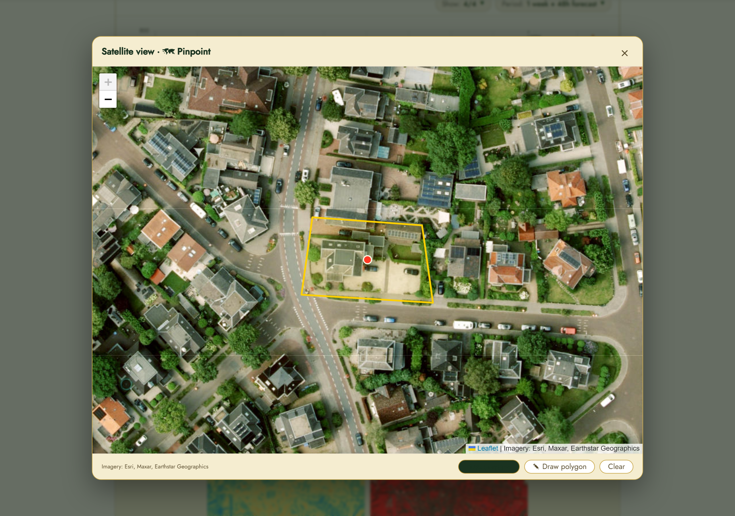
With «Pinpoint» you open a map with a sharp Esri background image. There you set the exact spot of your garden or field.
With «Draw polygon» you trace the outline of your field: click the corner points on the map and close the shape. The imagery and indices are then computed exactly within your field, instead of within a fixed square.
Already have the field boundary as a file? You can import a GeoJSON or KML.
4. Multiple locations, each with its own field
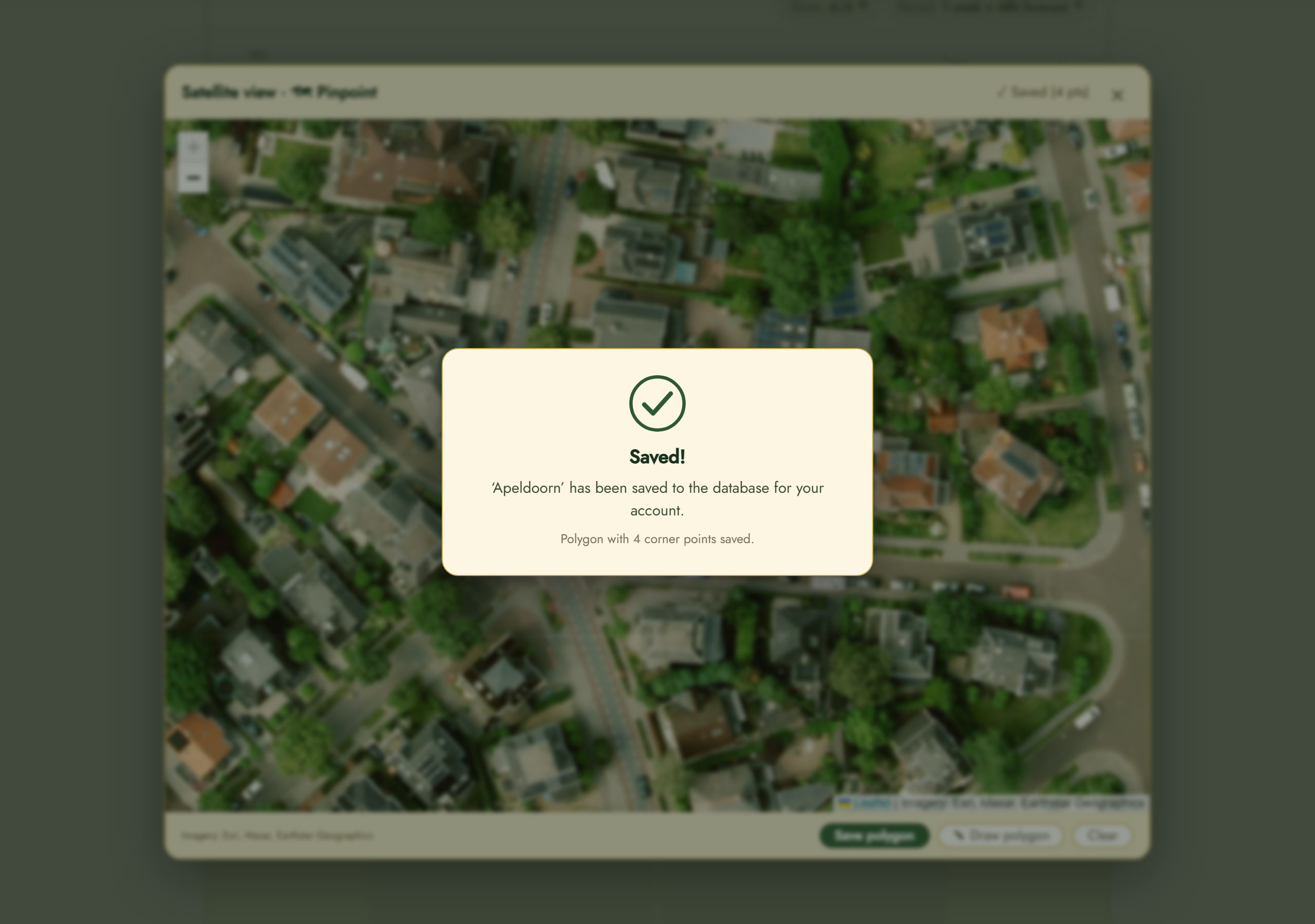
As soon as you click «Save polygon», a confirmation appears in the centre of the screen that your field has been saved to the database for you.
Under «Weather locations» you can add several locations. The top location in that list is your active one: that is what Pinpoint and the satellite view use.
Your field polygon is stored per location and per user. If you draw a field while a given location is at the top, that field belongs to exactly that location from then on, only for you.
Want to use another location? Drag it to the top under «Weather locations». The satellite view reloads automatically and shows the field you saved earlier for that location. This way every location keeps its own valid field boundary.
Drag another location to the top to activate its field.
5. Where do the images come from?
The images come from Sentinel-2, the Earth-observation programme of the European Union (Copernicus). Two satellites photograph all of Europe every few days, with open data that is used mainly for research and agriculture.
The same data that scientists use, we offer here directly to the grower: without your own satellite or expensive software you can watch your crop from space.
One pixel is about 10 by 10 metres. So it is ideal for fields and larger gardens; for a small vegetable patch you mostly see the broad picture.
6. Together with your sensors: predicting
The satellite image tells you how your crop looks above ground. Your local sensors (soil moisture, temperature, weather) tell you what happens on the ground.
Combine the two and you get a predictive system: a model learns from the past and estimates ahead when water, feeding or attention is needed. It scales from your hobby garden to a complete farm.
Scalable from a hobby garden to a complete farm.
7. Controls and settings
Use «Pinpoint» to set the exact spot; «Expand» opens the image large.
The widget automatically picks the most recent, least-cloudy scene. Use the arrows in the large window to browse to older or newer scenes.
8. Terrain layers from the elevation model
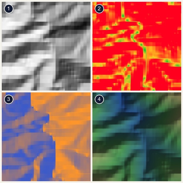
Besides the satellite imagery there are four terrain layers, computed from the Copernicus elevation model. This is not a photo but computed relief. The example shows a mountainous area.
1. Relief (hillshade): the shape of the land with shading, as if lit by a low sun.
2. Slope: how steep it is. Green is flat, yellow to red is steep. Steep parts dry out and run off faster.
3. Sun aspect: which way a slope faces. Orange faces south (more sun, warm), blue faces north (cooler, moister).
4. Elevation: low (blue) to high (sand colour). Cold air sinks into the lowest spots, where night frost strikes first.
9. Water pooling (wetness)
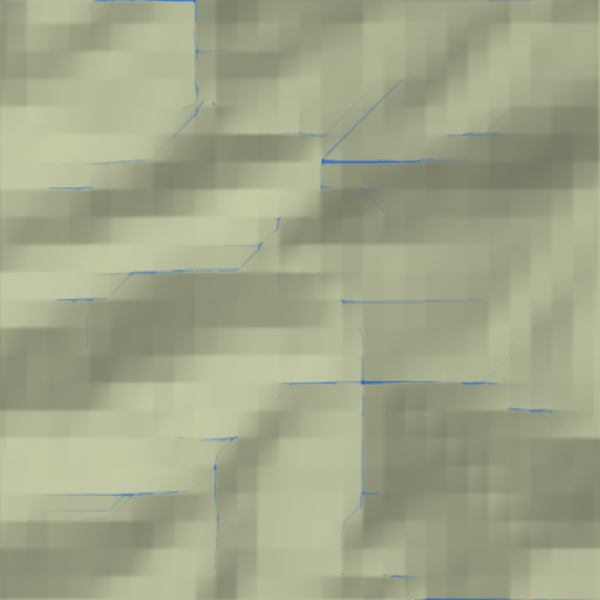
This layer computes from the elevation model where water flows and accumulates. The background shows the terrain calmly; the blue lines are where water collects, the natural drainage channels.
Blue means wet and low-lying, where water lingers; the lighter areas between drain better. Useful to decide where to add drainage or where to water less.
10. More vegetation indices: SAVI and NDRE
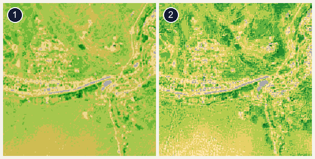
Besides NDVI there are two extra vegetation indices that each cover a weakness of NDVI. The example shows a forested area.
1. SAVI: soil-adjusted. More reliable on young or sparse growth with bare soil between plants, because the soil is not counted as vegetation.
2. NDRE: red-edge. Stays sensitive where NDVI saturates on dense, mature growth, so good for spotting chlorophyll and nitrogen differences in a full season.
Darker green means more or healthier vegetation in both cases.
Sensor dashboard
Each of your own sensor devices (e.g. Office, Barn, Beehive) has a dashboard that shows its measured values over time. Use the index below.
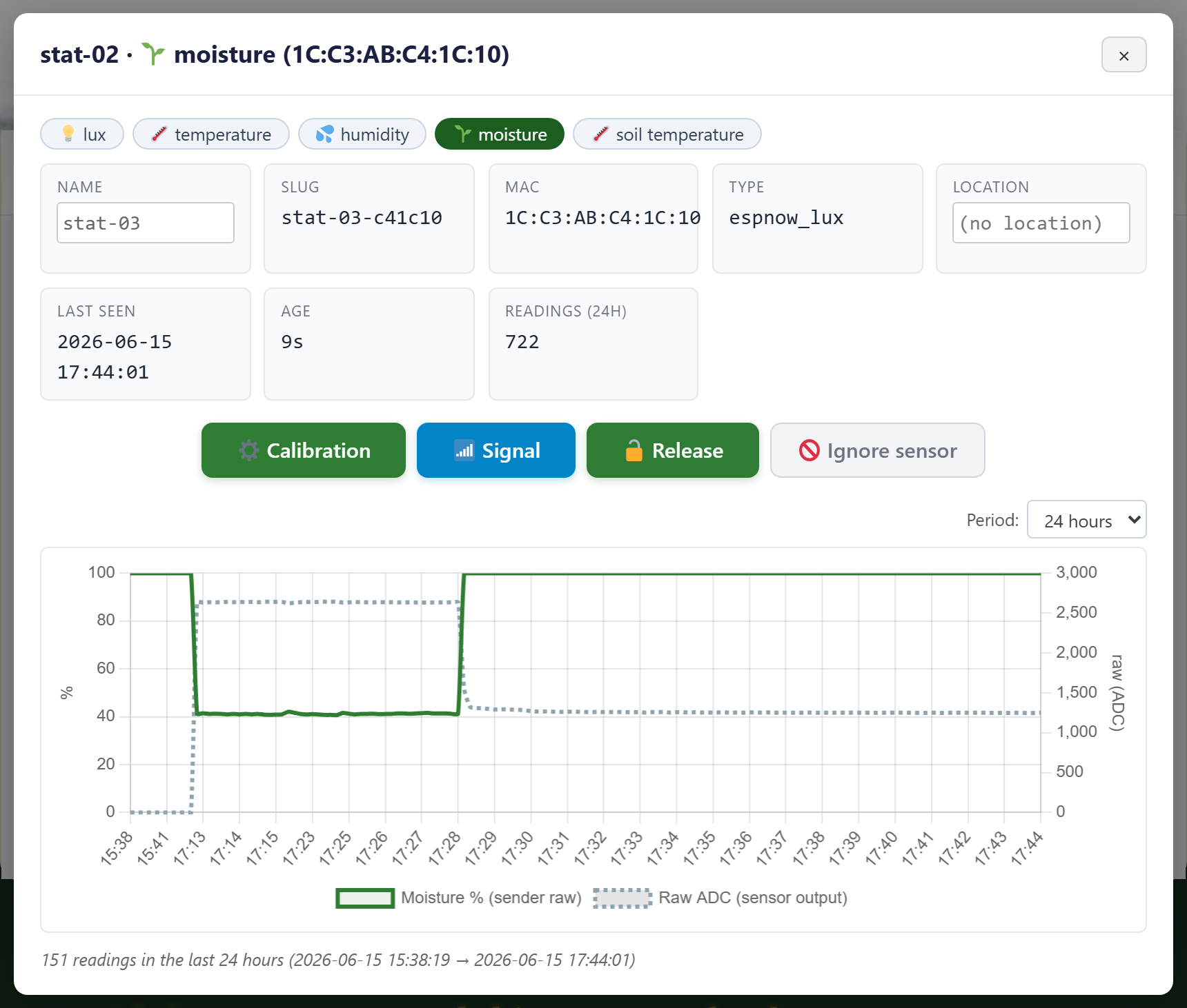
1. What this shows
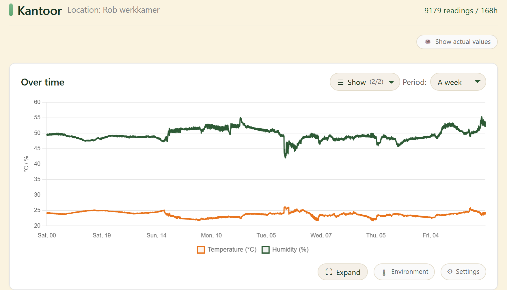
At the top are the device name, the location and the number of readings. The «Over time» chart shows this device’s measured series, such as temperature and humidity.
Use «Show» to pick which series you see and «Period» for the time window; «Show actual values» jumps to the latest reading.
2. Settings window
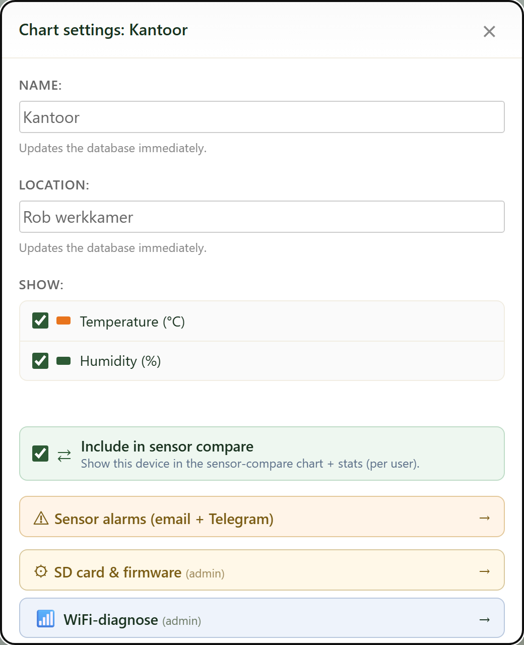
The «Settings» button (gear) opens this window. At the top you edit Name and Location and use «Show» to choose which series the chart displays.
«Include in sensor compare» decides whether this device counts in the sensor comparison and the ML/AI models.
Below (for admins) are the buttons Sensor alarms, SD card & firmware, WiFi-diagnose and ESP-NOW devices — explained below.
3. Sensor alarms (email + Telegram)
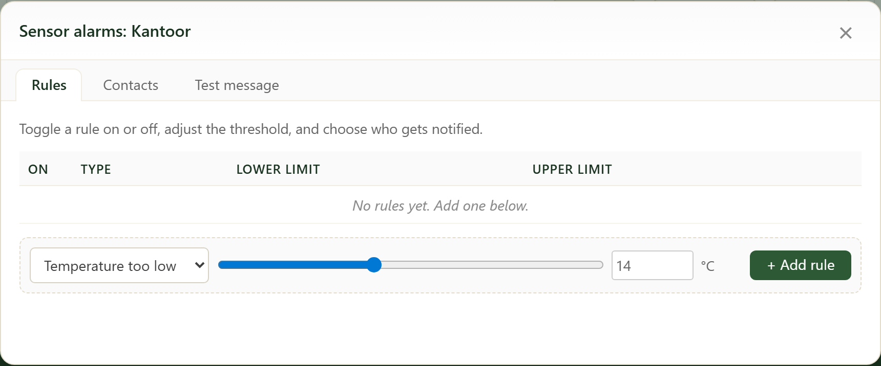
Like the weather alarms, but for this device. Per measurement you set thresholds (e.g. temperature too high or too low) and pick which contacts get notified by email or Telegram.
The tabs let you manage the rules and the contacts and send a test message.
4. SD card & firmware (admin)
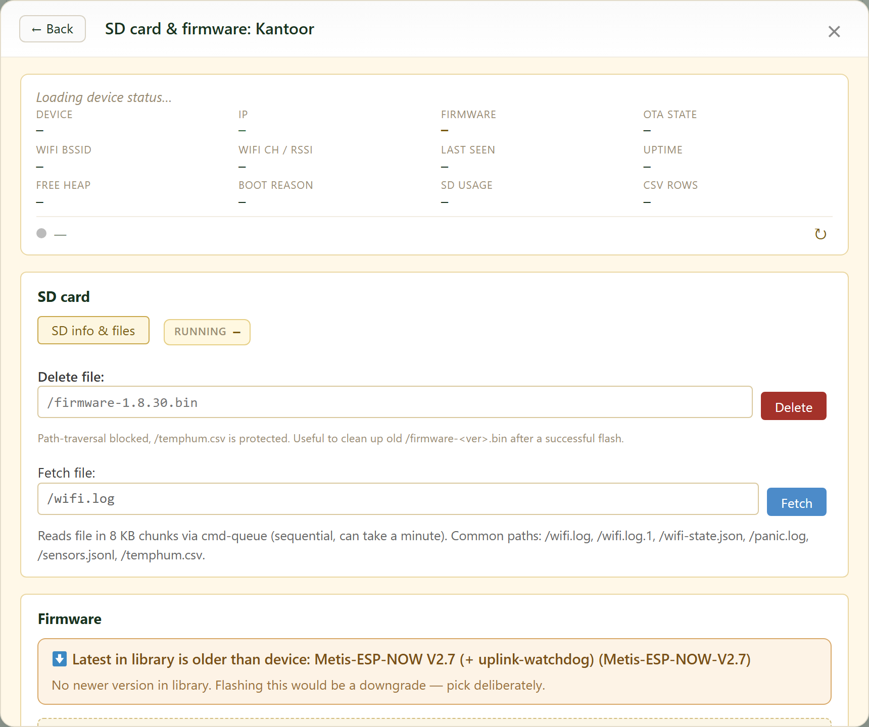
Admin function (requires an admin token on the device). At the top is the device status (IP, firmware, uptime, free heap, SD usage...).
Under SD card, «SD info & files» opens the file list: each file has a download button and you clean up old files with «Delete».
Under Firmware you send a new version to the SD, flash it or roll back. «Find/fill gaps» recovers missing readings.
5. Downloading files
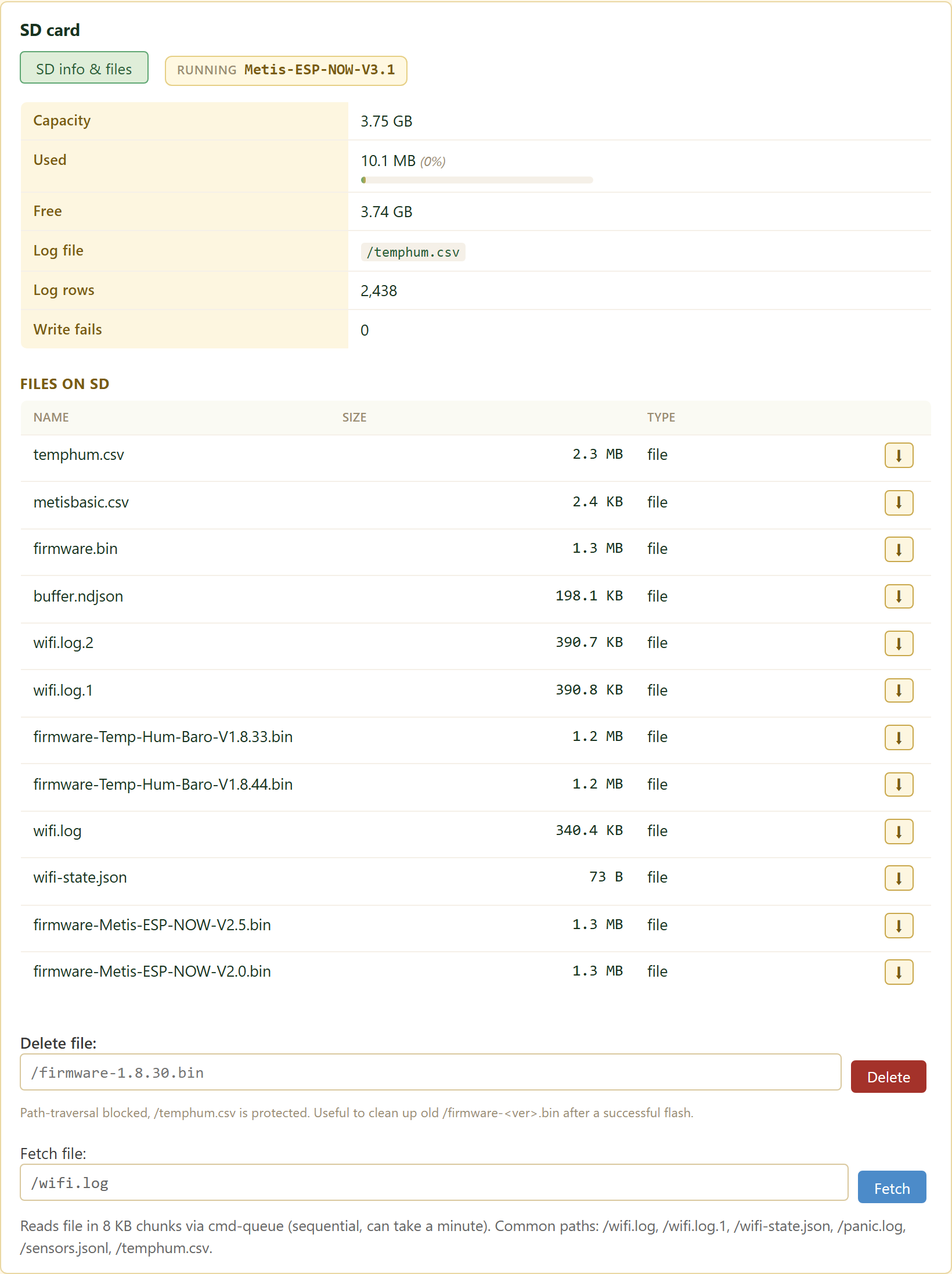
Click «SD info & files» for the file list with name, size and type.
Each file has a download button. It reads the file in blocks and then offers it as a download in your browser.
Need a specific path? Type it under «Fetch file». Very large files are read up to 2 MB.
6. The SD card will not fill up
The device keeps the files small itself, so there is no need to worry about the SD card filling up.
The measurement log /temphum.csv rolls over automatically once it reaches 10 MB. Up to 8 older versions are kept; the oldest drops off by itself. /temphum.csv is protected and cannot be erased by accident.
Only old firmware files (/firmware-<version>.bin) are cleaned up by you after a successful flash with «Delete».
The WiFi diagnostics /wifi.log works the same, but at 400 KB and 2 copies.
7. Fill gaps from the SD card
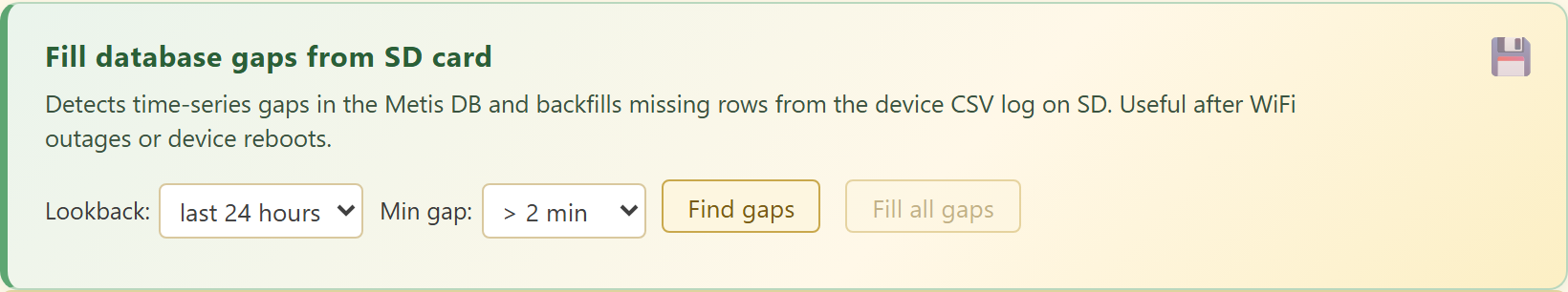
The device always keeps logging locally to the SD card, even when the wifi drops or it reboots. A gap then appears in the cloud chart, but the reading is still on the SD.
With «Find gaps» the system scans the database for missing periods; first pick a lookback period and a minimum gap size. With «Fill all gaps» it pulls the missing rows from the CSV log on the SD and puts them into the database after all.
This makes your chart complete again, even after a wifi outage. If nothing is found, there is nothing to recover.
Handy after a wifi outage or a device reboot.
8. WiFi diagnostics
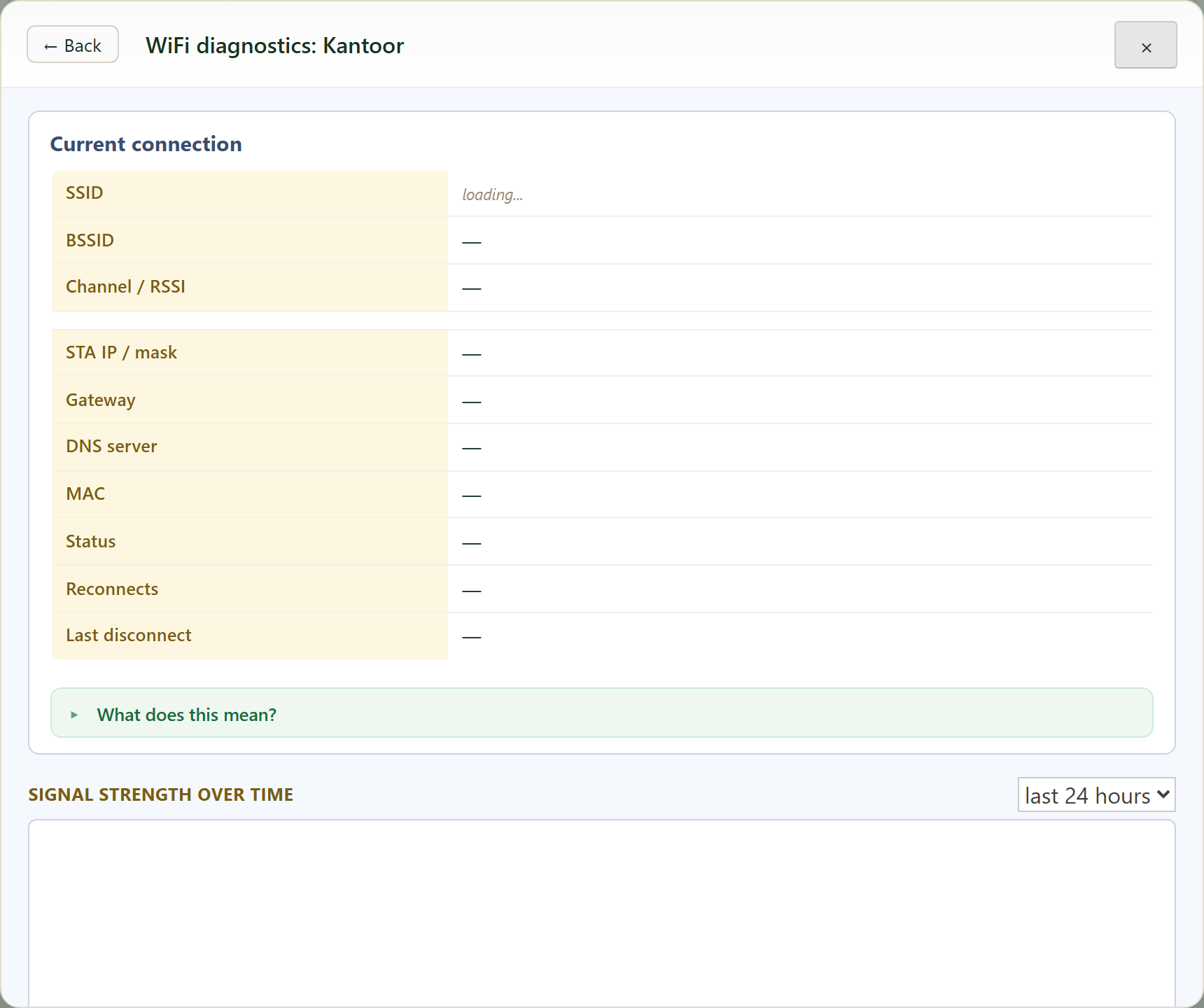
This is how you analyse the device’s wifi. «Current connection» shows SSID, BSSID, channel/signal (RSSI), IP, gateway, DNS, MAC, status, reconnect count and the last disconnect reason.
The «Signal strength over time» chart shows how stable the signal is. «Scan» and «Run test» force a fresh measurement.
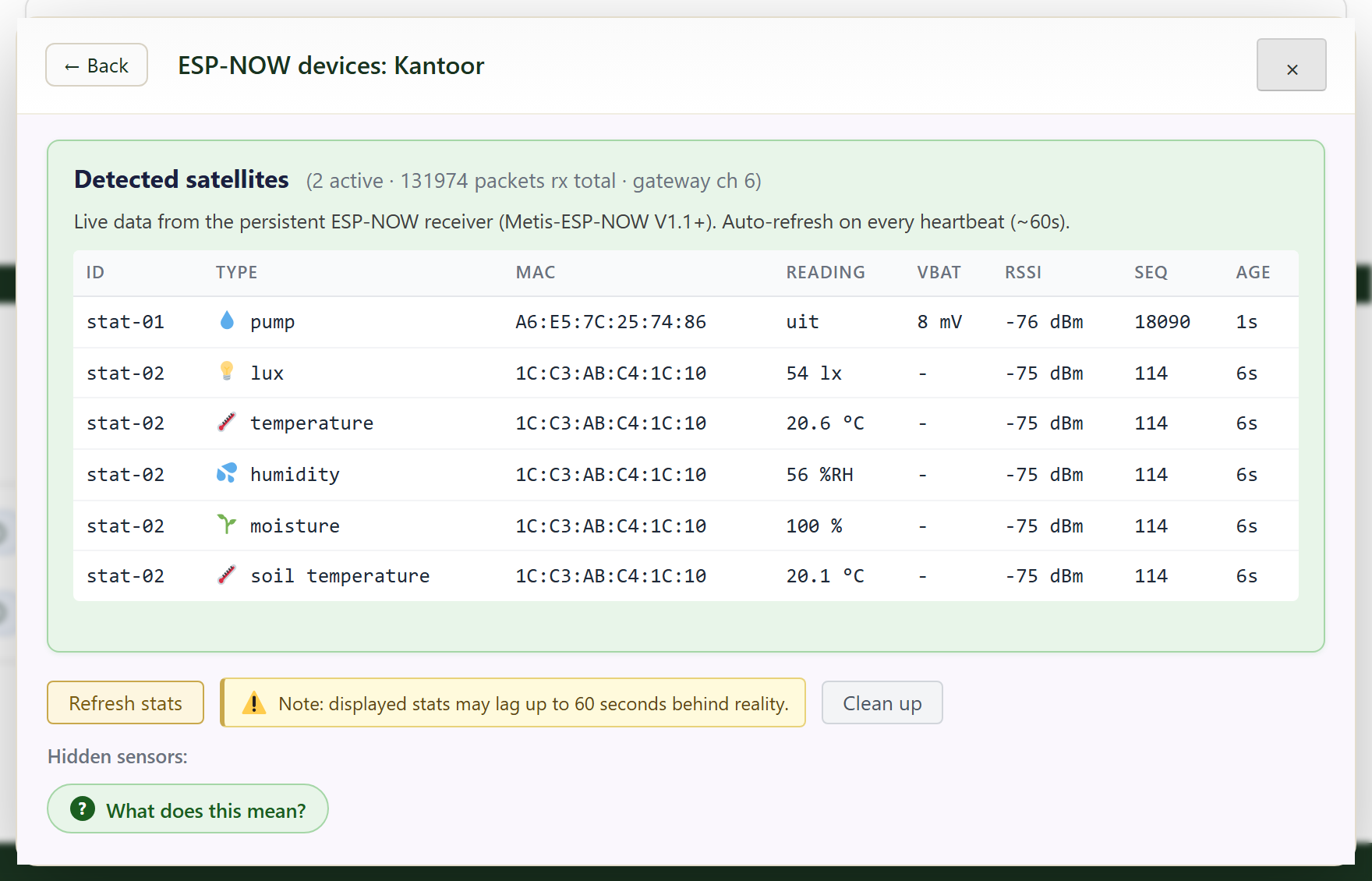
9. ESP-NOW devices
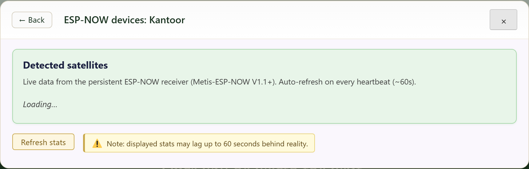
ESP-NOW devices are wireless units that talk to each other over ESP-NOW, a low-power radio protocol built into the ESP chips.
They need no wifi of their own: they send their data straight to a nearby datalogger, so you can place cheap sensors and switches at a distance, even where there is no wifi.
- GatewayA datalogger with wifi. It is the bridge to the FairGrow cloud.
- SatelliteA small device without wifi: a sensor (for example soil moisture or light) or an actuator such as the pump. This card shows, per gateway, which satellites are detected; the list refreshes on every heartbeat (~60s) and «Refresh stats» forces an update.
- Data directionA satellite broadcasts its reading. Every gateway on the same channel hears it directly, and the gateway with the strongest signal forwards it to the cloud over wifi. The stats may lag up to ~60s.
- Command directionPress a button (for example pump on) and it first goes to the FairGrow cloud, which queues it for the gateway the device is locked to. That gateway picks it up over wifi and, as the last step, sends it straight to the device over ESP-NOW radio. Only that last step is direct radio; the rest runs over wifi and the cloud.
- Automatic (ML/AI)The pump does not have to be manual. Based on the soil-moisture readings plus evaporation and weather models, an ML/AI model can decide by itself when watering is needed and switch the pump on at the right moment, with no action from you.
Sensors send their readings back the same way: satellite to gateway (ESP-NOW), gateway to cloud (wifi).
10. Environment classification & features
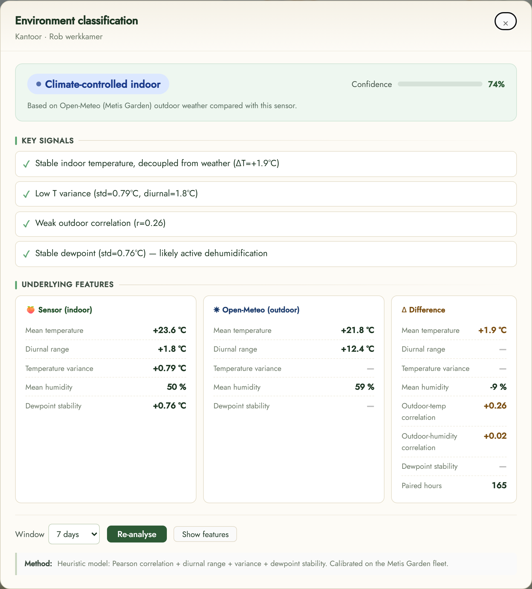
With «Environment» the system automatically determines what kind of environment the sensor is in (e.g. climate-controlled indoor, outdoor or greenhouse) by comparing its readings with the outdoor weather (Open-Meteo).
You get a confidence score and the key signals.
«Show features» reveals the underlying features (mean, spread, dewpoint, correlation with outdoors). «Re-analyse» and the period window recompute it.
11. Controls and settings
«Expand» opens the chart large, «Environment» shows the surrounding context and «Settings» controls series, alarms and whether the data is included in sensor compare. The data comes straight from your device and refreshes continuously.
Sensor compare
Sensor compare puts several sensors side by side for one quantity, so you can see how well they agree. Use the index below.
1. What this shows
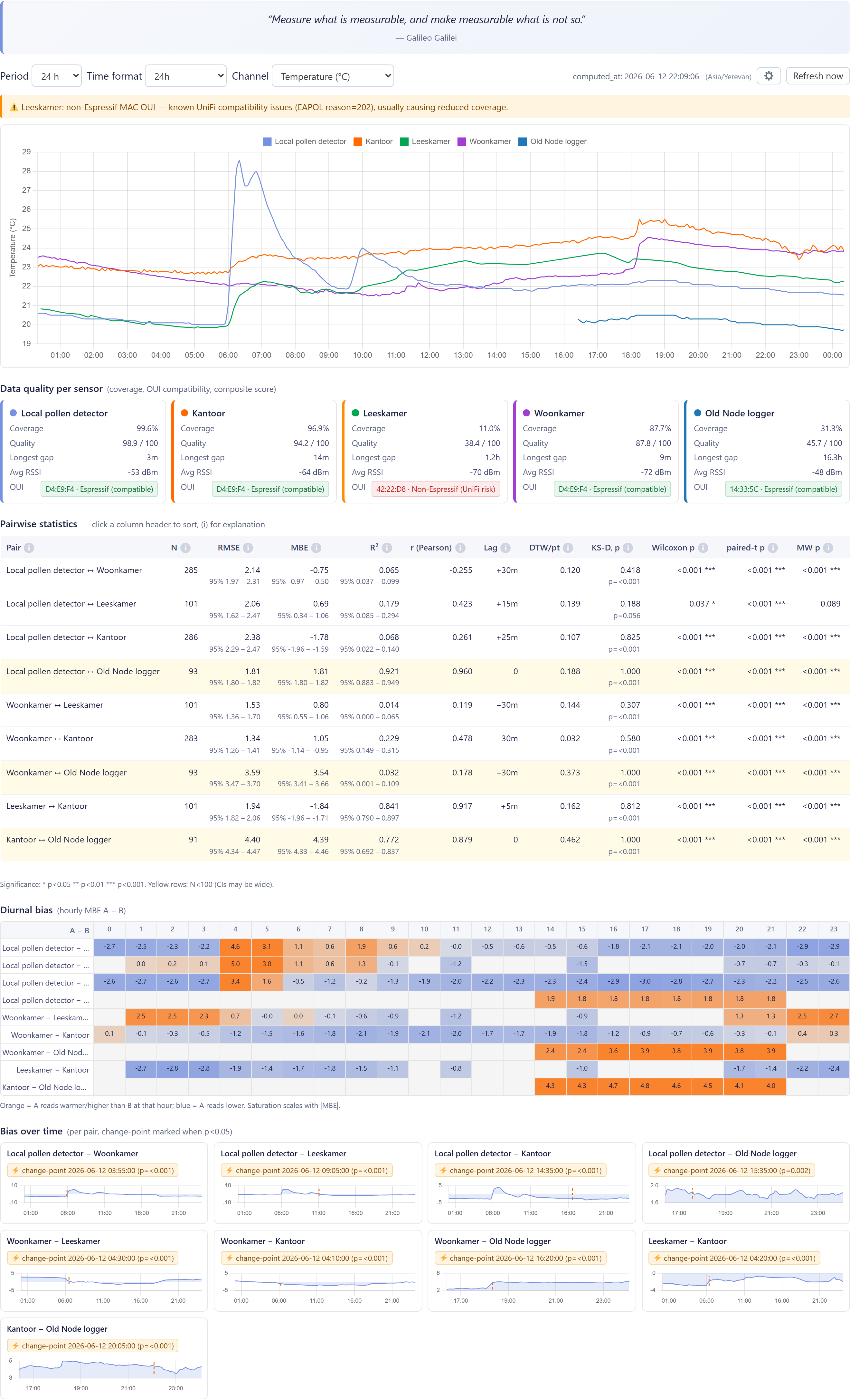
At the top you pick the quantity (Channel), the period and the time format. The chart overlays all sensors.
Below are «Data quality per sensor» (coverage, quality, longest gap, signal) and the «Pairwise statistics» with RMSE, MBE, R² and correlation: the smaller the difference, the better the sensors agree.
2. How it works
Putting several sensors and locations side by side gives insight a single sensor cannot.
Add weather series too for better predictions.
3. Controls and settings
This data feeds the ML and AI models that compute predictions and deviations for the grower. «Refresh now» recomputes the statistics; per widget you decide via «Include in sensor compare» whether it counts.
Weather now
Weather now shows the current weather, the forecast and all related settings for your location. Use the index below to jump to a topic.
1. Title and location

Top-left shows the widget name and the selected location. If you set up multiple locations, arrows appear in the header to switch between them.
2. How it works
Current weather and forecast together drive the weather alarms that warn you in time.
Set recipients and thresholds under «Weather alarms».
3. Wind gusts (GUST)
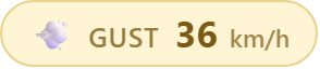
The coloured badge shows the highest expected wind gust. Green is calm, yellow is breezy, red is storm.
4. Current conditions
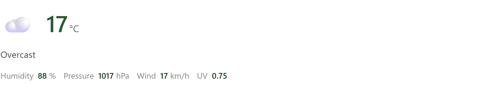
The large temperature with weather description, plus humidity, air pressure, wind speed and the current UV index.
5. Multi-day forecast
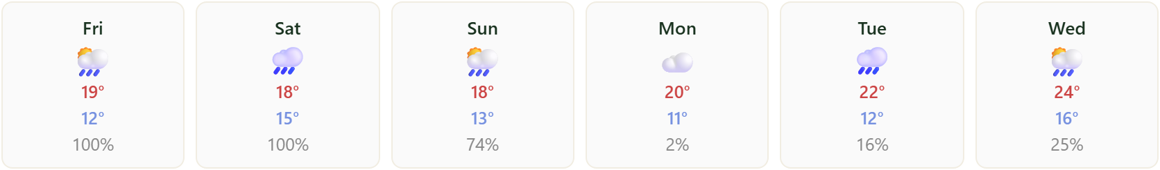
A six-day outlook with, per day, a weather icon, the high and low temperature and the chance of precipitation in percent.
6. Hourly chart
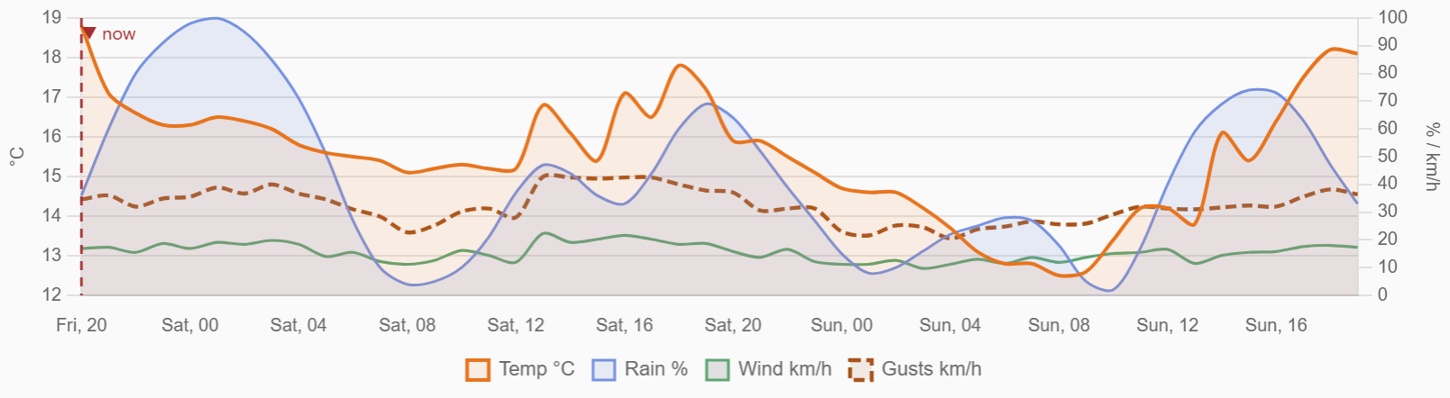
The chart shows the hour-by-hour trend for the chosen period. Below the chart a legend lists the visible lines.
7. Show or hide lines
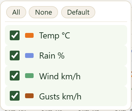
Use the Show button to choose which lines appear: Temp °C (orange), Rain % (blue), Wind km/h (green) and Gusts km/h (brown). All turns everything on, None off, Default the standard set. Use Period to switch between 24 hours, 48 hours and 7 days.
8. Settings
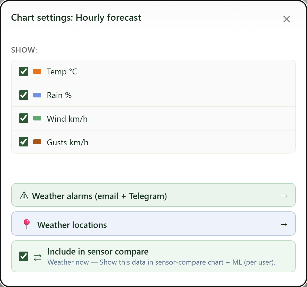
The Settings button (gear) opens this panel. At the top you toggle the same lines. Below it are three controls: Weather alarms (email + Telegram), Weather locations and the Include in sensor compare switch.
9. Choose a weather source
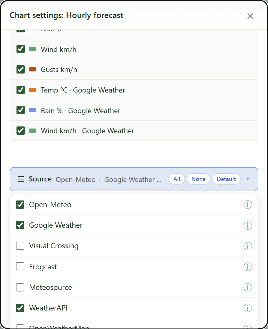
The Source button lets you choose which weather service provides the data. Open the list and tick one or more sources: Open-Meteo (default, free), Google, Visual Crossing, Frogcast, Meteosource, WeatherAPI and OpenWeatherMap. Click the ⓘ icon next to a source for a short description and its strengths. All, None and Default are quick selectors; your choice is applied only when you click Apply, so you can calmly tick several sources.
10. Compare sources
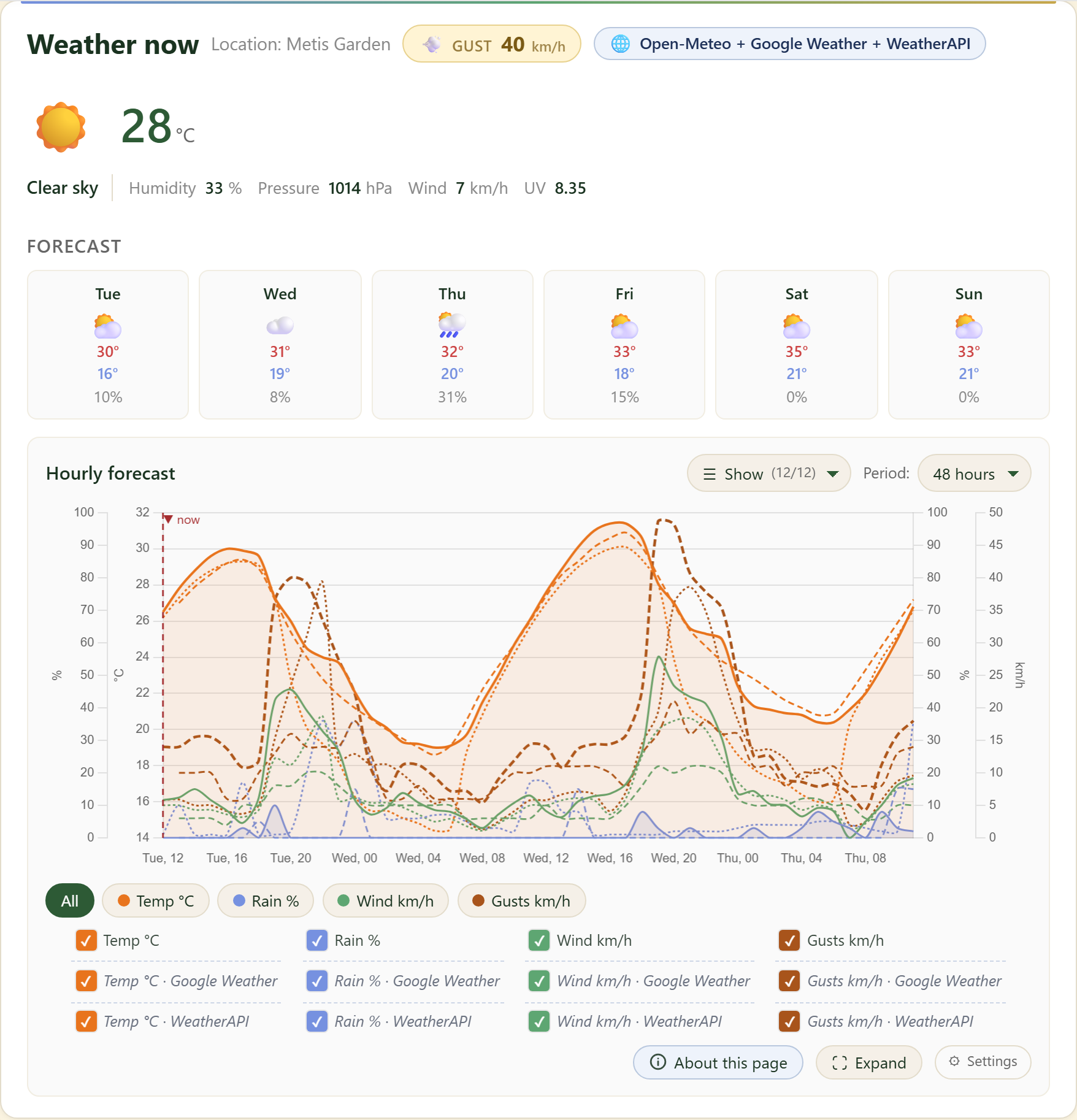
When you tick more than one source, the extra sources are overlaid on the chart as dashed lines. The badge at the top shows which sources are active (for example Open-Meteo + Google + WeatherAPI). In the legend each source gets its own row, so you can compare the services side by side per weather element.
11. Compare per element
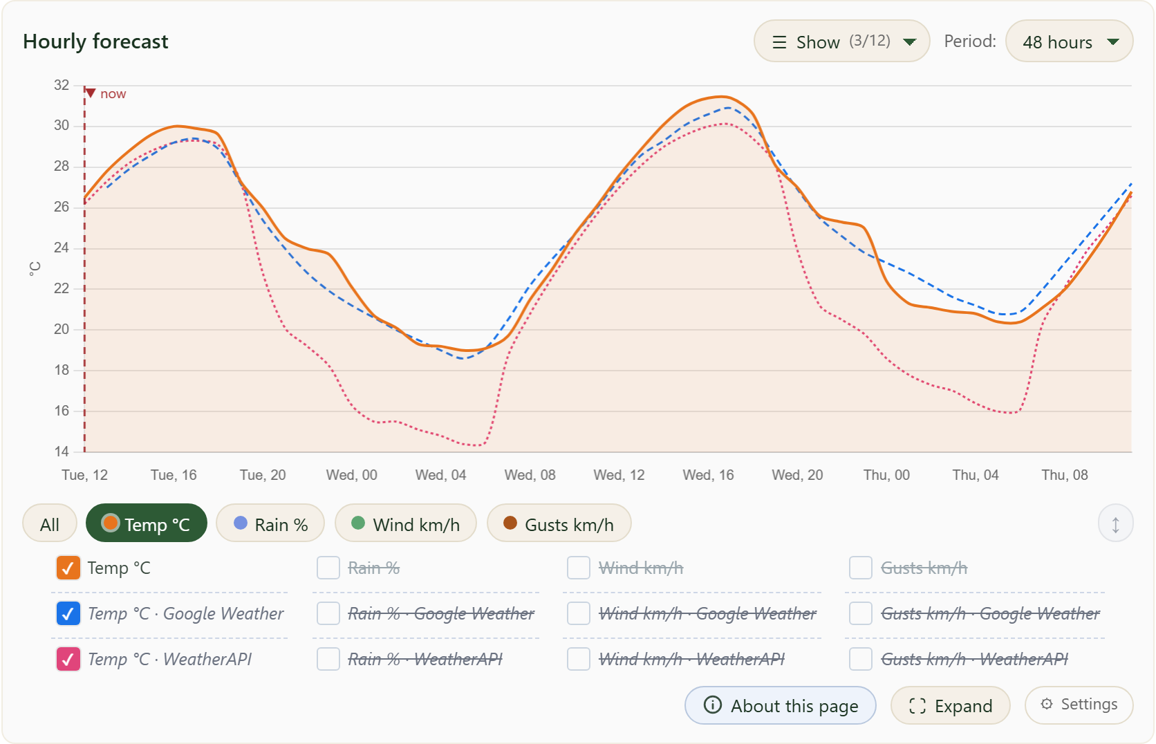
Above the legend are buttons per weather element: Temp, Rain, Wind and Gusts (and All). Click one element and only that element stays visible for every source, with each source in its own colour. This makes it easy to see at a glance how the services differ for that single element. All shows every line again.
12. Spread between sources
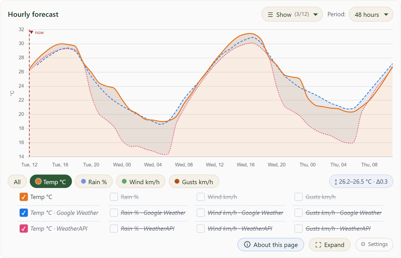
With a single element selected, a grey band appears between the lowest and highest source per hour: a narrow band means the services agree, a wide band means they diverge. The badge on the right (↕) shows the current spread as min–max with the difference (Δ). Click the badge to turn the band and label on or off; your choice is remembered.
13. What are the weather alarms for?
Weather alarms warn you in time about weather that can harm your plants: frost, heat, storm and gusts, heavy rain, high UV or a rapid pressure drop.
That lets you act in time, for example covering up before frost or watering extra in a heatwave. You can also have a fixed daily weather report sent with the forecast for your location.
Besides individual alarms you can also receive a fixed daily weather report.
14. How to set up a weather alarm
Set up an alarm in five steps. The details are in the points below.
First add your contacts (email or Telegram), then choose a rule with the right threshold, select the recipients, send a test message to check, and finally switch the rule on.
No recipient chosen? Then nothing is sent, even if the rule is on.
15. Weather alarms: rules
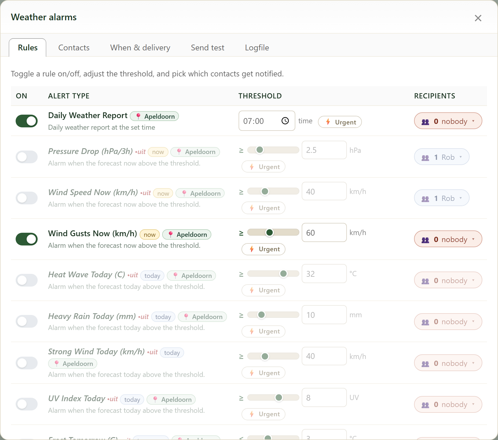
In Settings click Weather alarms. On the Rules tab you set a threshold per alarm type (gusts, frost, heat, heavy rain, UV, pressure drop, ...) and pick who gets notified. A green switch means the rule is active.
16. Contacts (email + Telegram)
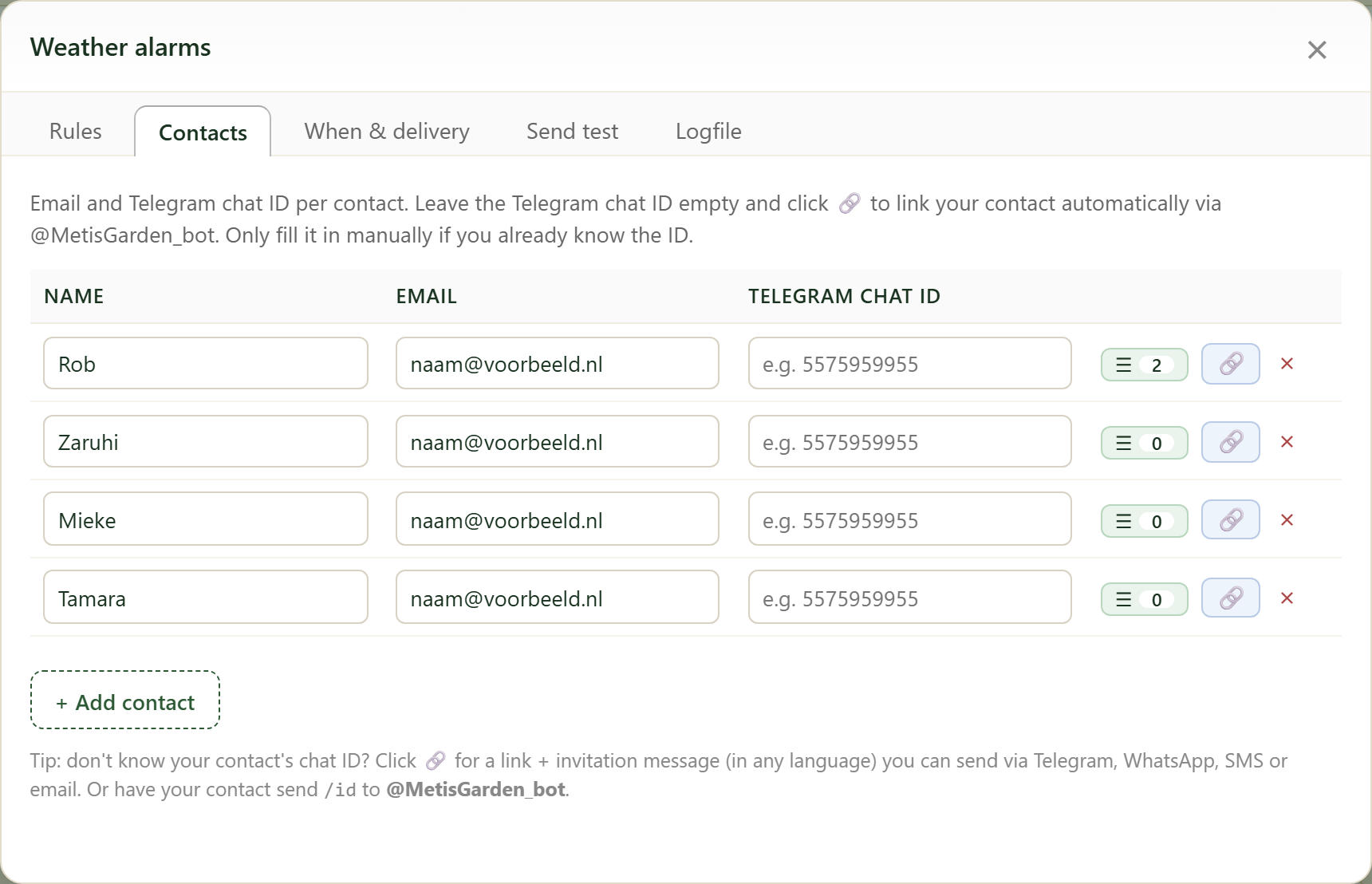
On the Contacts tab you manage each person’s email and Telegram chat ID. Don’t know the chat ID? Click the link icon for an invitation, or have the contact send /id to @MetisGarden_bot.
17. When & delivery
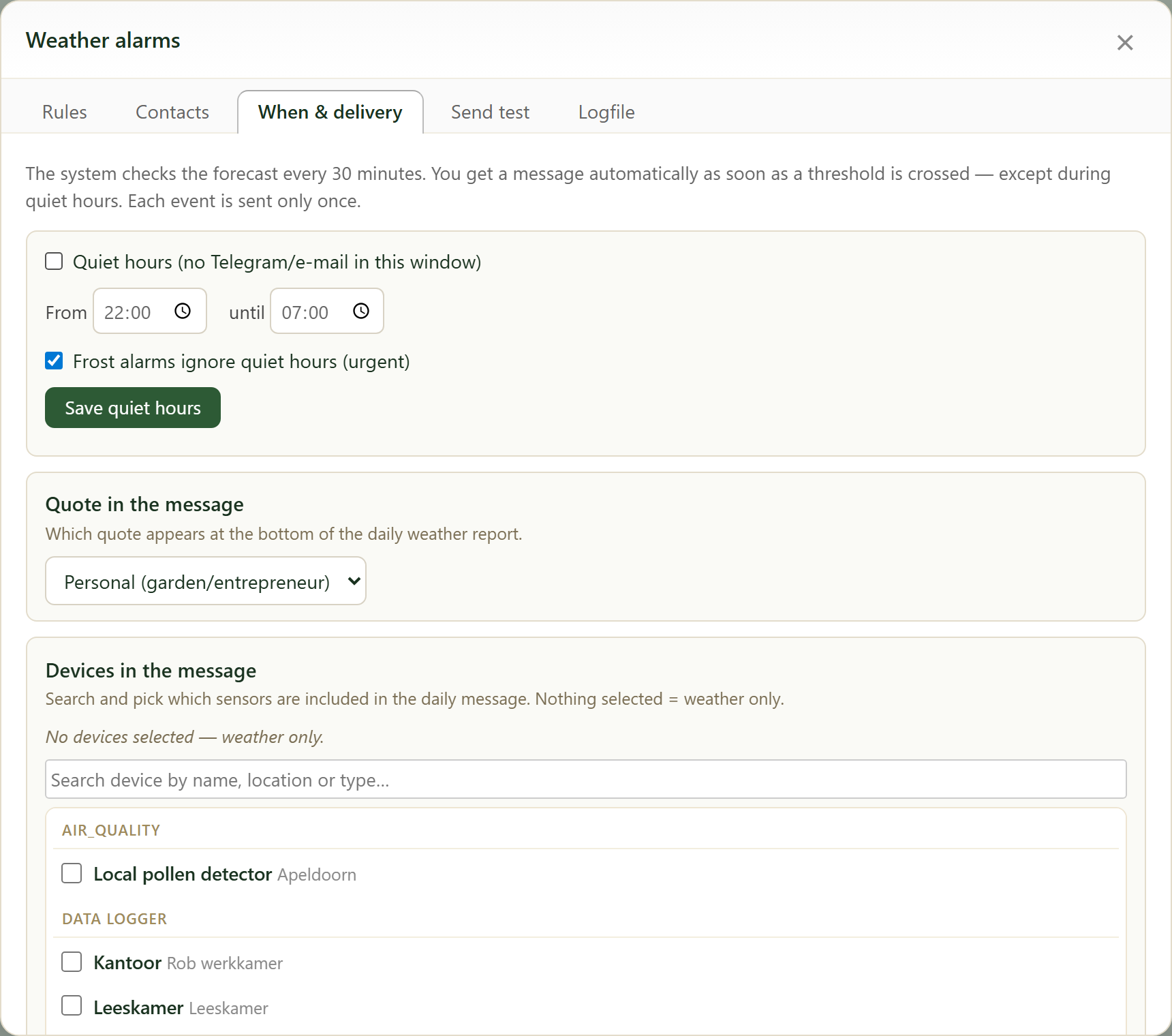
On When & delivery you set quiet hours (no messages between e.g. 22:00 and 07:00; frost alarms may ignore them), choose the quote at the bottom of the message and select which sensors are included in the daily report. Nothing selected = weather only.
18. Daily weather report: who gets it?
The Daily weather report is a rule on the Rules tab with a time (e.g. 07:00). In the Recipients column you choose which contacts receive it; if it says nobody, nothing is sent.
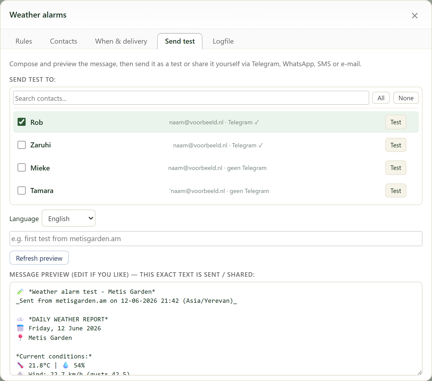
The message contains the current conditions, the forecast, optionally your sensors and a quote. Use Send test to preview and test it immediately.
19. Weather locations (max. 10)
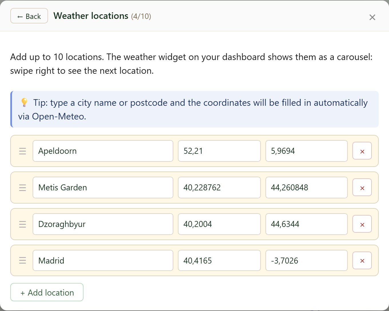
Via Weather locations you manage up to 10 locations; type a place name and the coordinates are filled in automatically (Open-Meteo).
Drag the handle to reorder. Note: the top location is the leading one, it sets the location for Weather now and the satellite view.
20. Include in sensor compare (ML/AI)
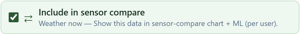
With Include in sensor compare you add this weather data to the sensor comparison. That data feeds the ML and AI models that make predictions for the grower, such as deviations and trends per location. Set per user.
21. Expand and Settings

Below the chart are two buttons. Expand opens the chart in a large, resizable window. Settings opens the panel from point 7.